Project Overview
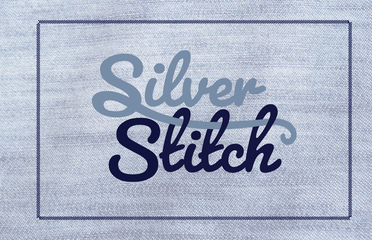
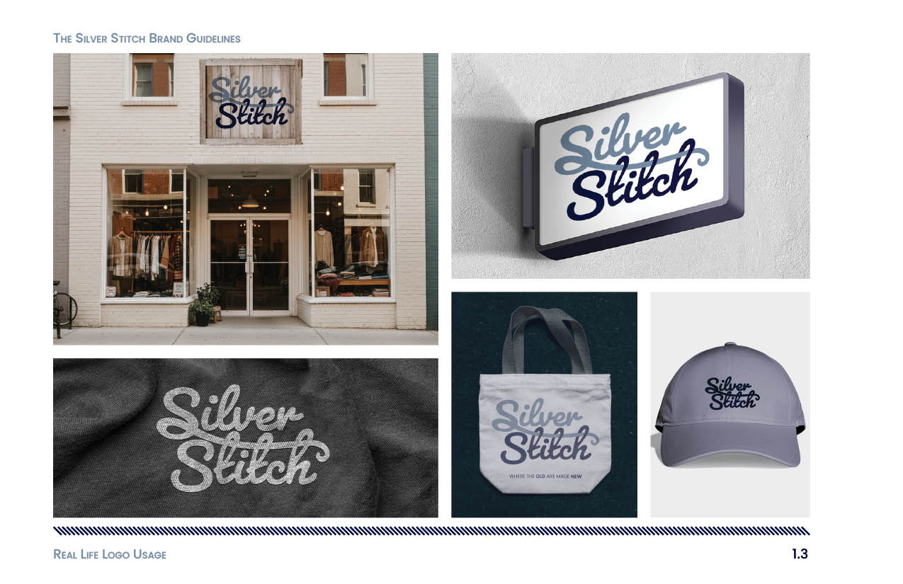
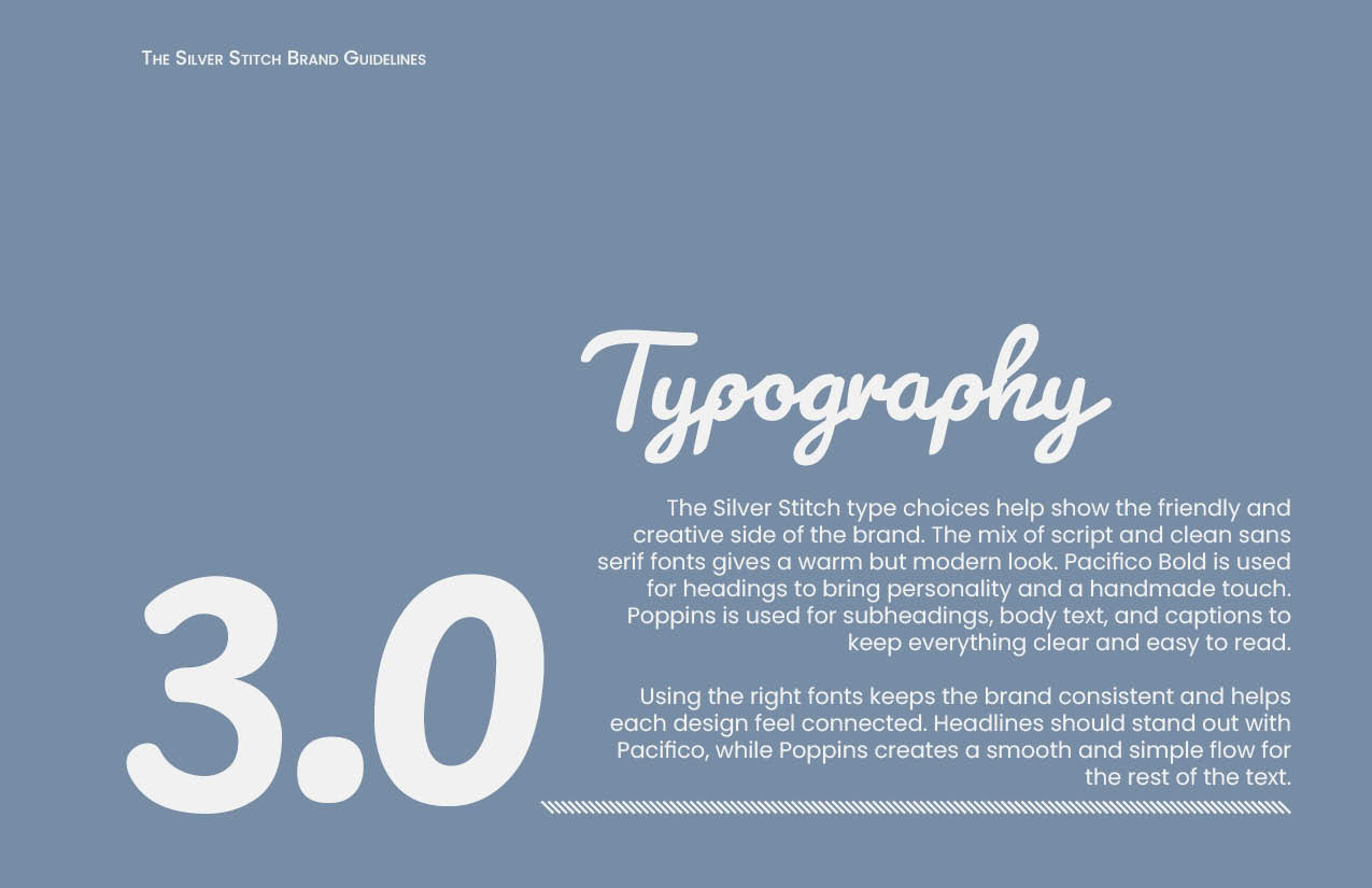
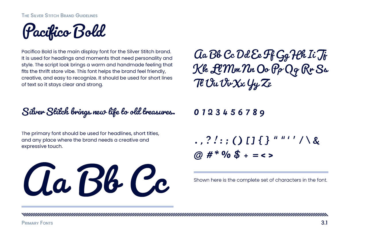
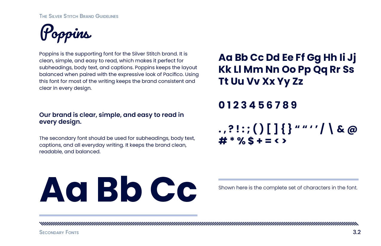
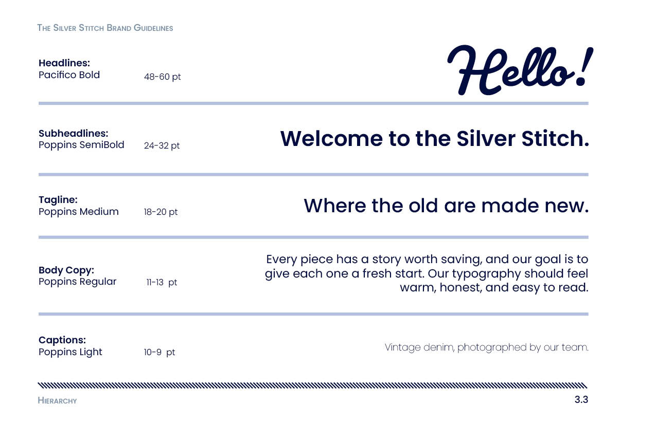
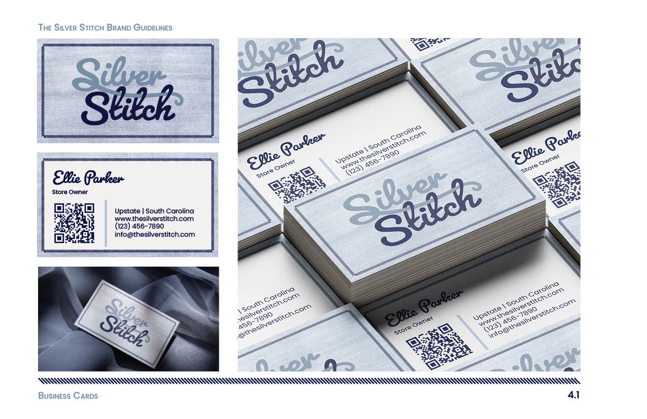
Silver Stitch is a brand identity project created to define and showcase the visual system for a thrift and upcycled clothing brand. The project includes a brand guideline booklet, a series of social media designs, and a direct mail piece. Together, these pieces present the logo, typography, color palette, imagery, and overall mood, along with real-world applications such as a storefront, business cards, clothing tags, and promotional materials. The goal was to create a clear and cohesive brand system that could be applied consistently across both print and digital platforms.
The Problem
The challenge was to create a brand identity that feels clean, modern, and intentional while still reflecting the warmth and creativity of thrifted and upcycled clothing. Many resale brands lean too heavily into either a vintage aesthetic or a trend-driven look, so Silver Stitch needed to find a balance. The brand had to feel thoughtful, approachable, and sustainable without becoming visually cluttered or outdated.
Target Audience
Silver Stitch is designed for people who enjoy thrifting and upcycling clothing and who value creativity, sustainability, and individuality. The brand speaks to customers who appreciate giving old items new life and are drawn to pieces that feel curated and one of a kind rather than mass-produced.
Brand Needs
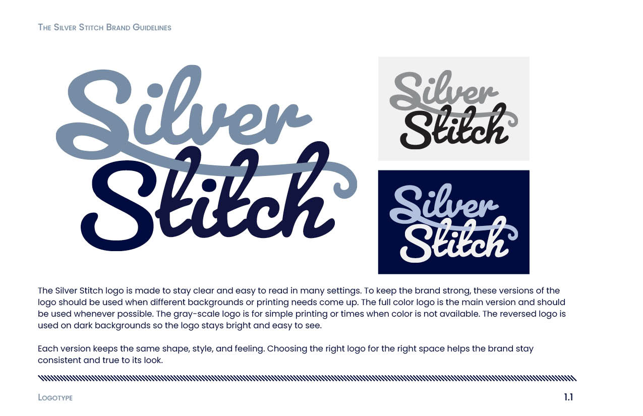
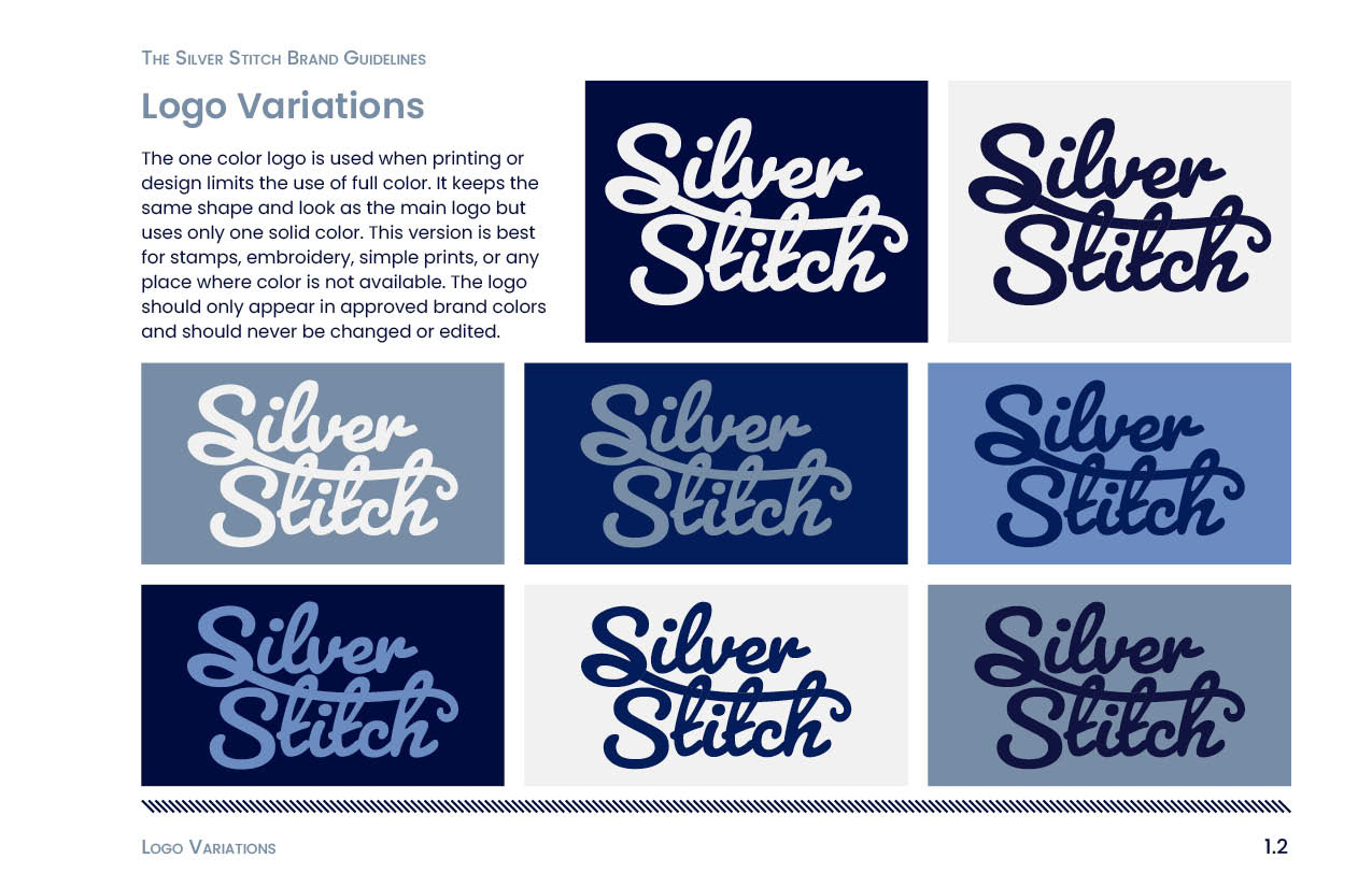
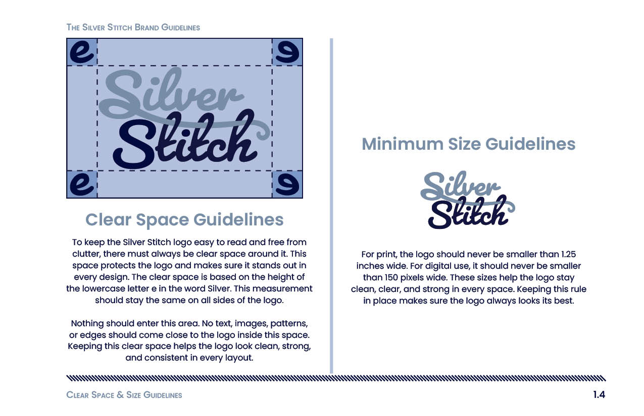
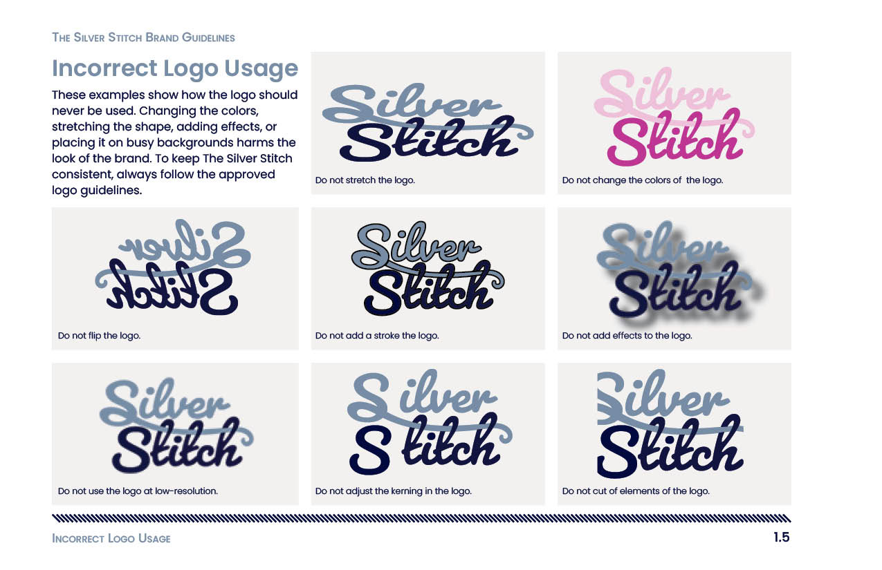
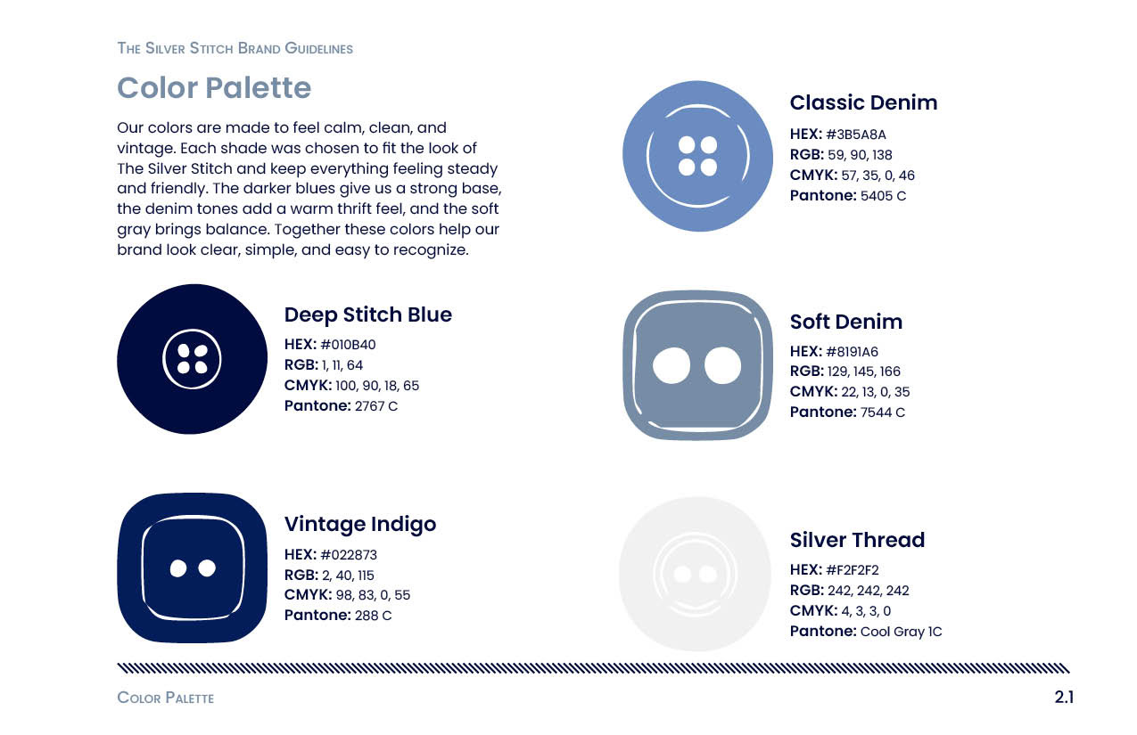
The brand needed a strong and flexible visual system that could clearly communicate its identity across multiple touchpoints. This included a recognizable logo, a calm and cohesive color palette, readable typography, and a structured layout system that would translate across print materials, social media, and promotional pieces.
Brand Identity Booklet
Research and Inspiration
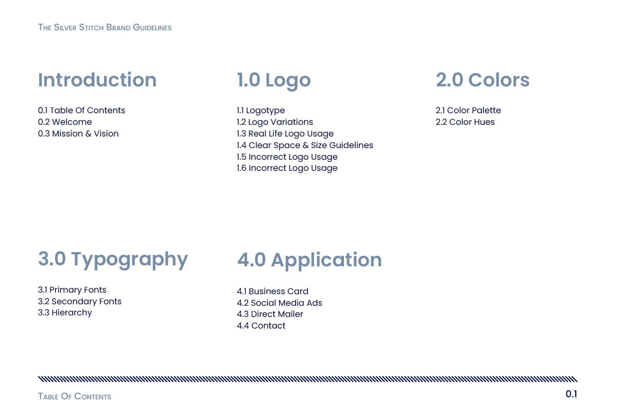
During the research phase, I studied other brand identity booklets to understand how information can be organized clearly and effectively. I also looked at thrift stores and upcycling brands to see how they visually communicate sustainability and creativity. This research helped guide both the layout of the booklet and the brand's overall tone, ensuring it felt curated rather than chaotic.
Key Design Decisions
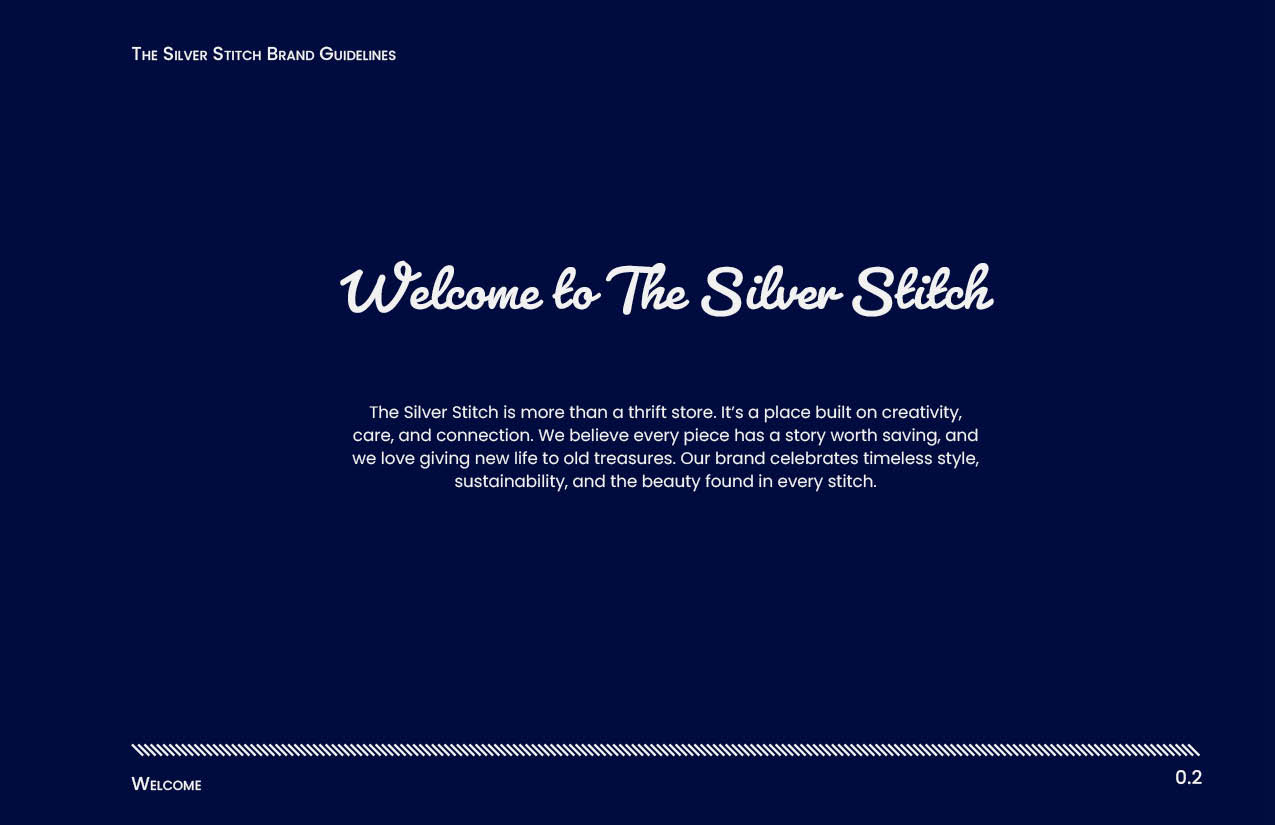
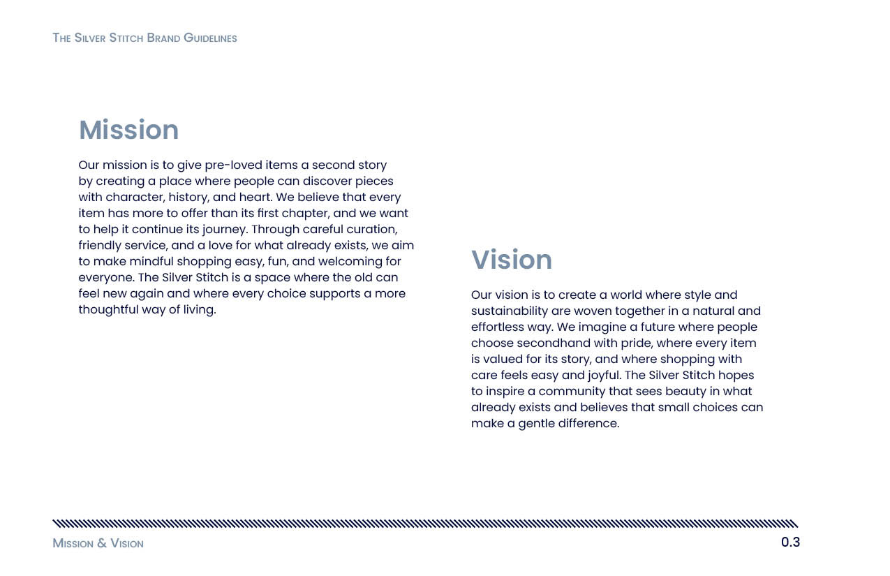
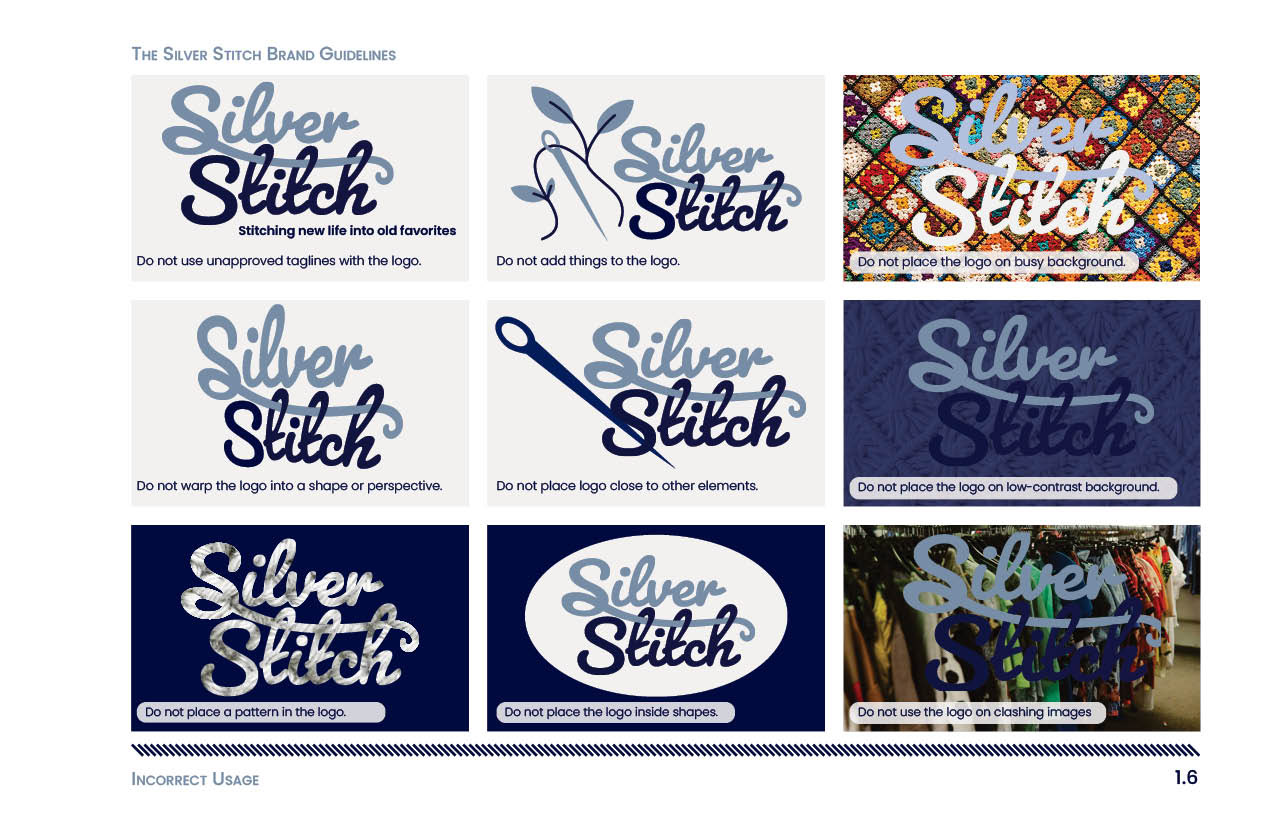
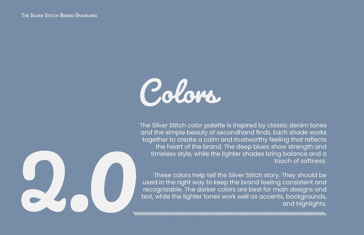
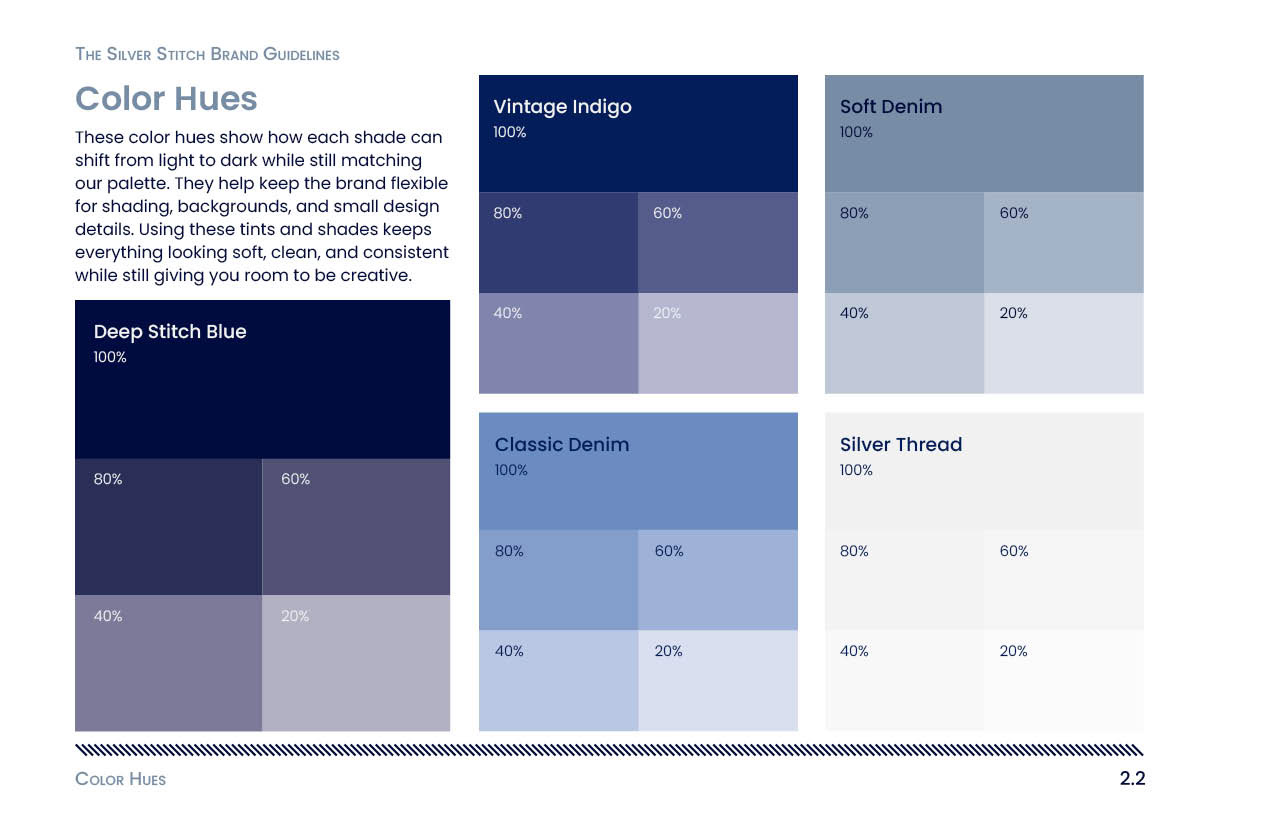
A grid-based layout was used throughout the booklet to keep the design clean, organized, and easy to follow. To create consistency across pages, a diagonal line pattern was added to the bottom of each spread, referencing stitching in clothing. This detail reinforces the concept of construction and repair while remaining subtle.
Challenges and Revisions
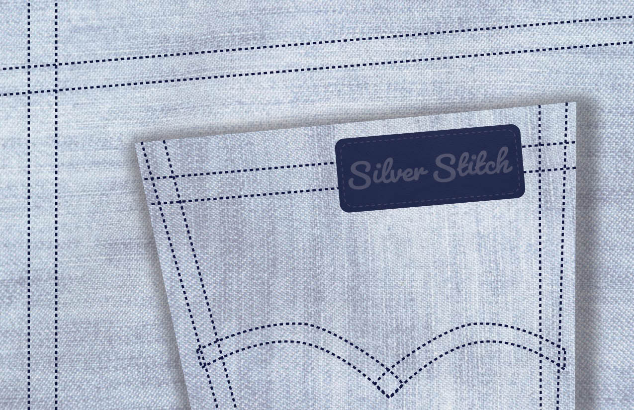
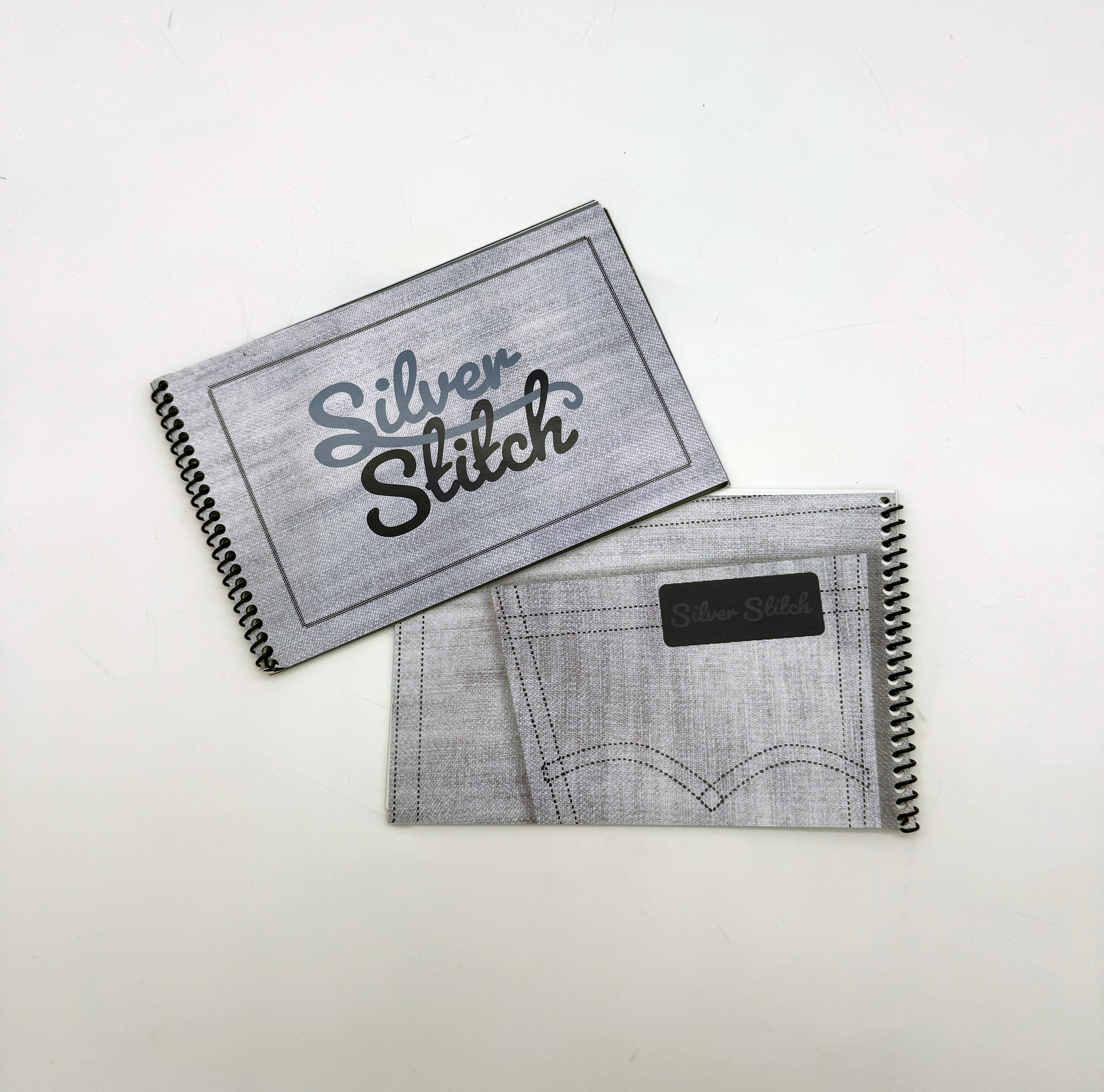
One of the biggest challenges during the process was designing the back cover of the booklet. The initial concept included a pocket detail, but it felt forced and visually unbalanced. After revisiting reference images of denim and garment construction, I developed a new direction that felt more natural and aligned with the brand.
Social Media
Research and Inspiration
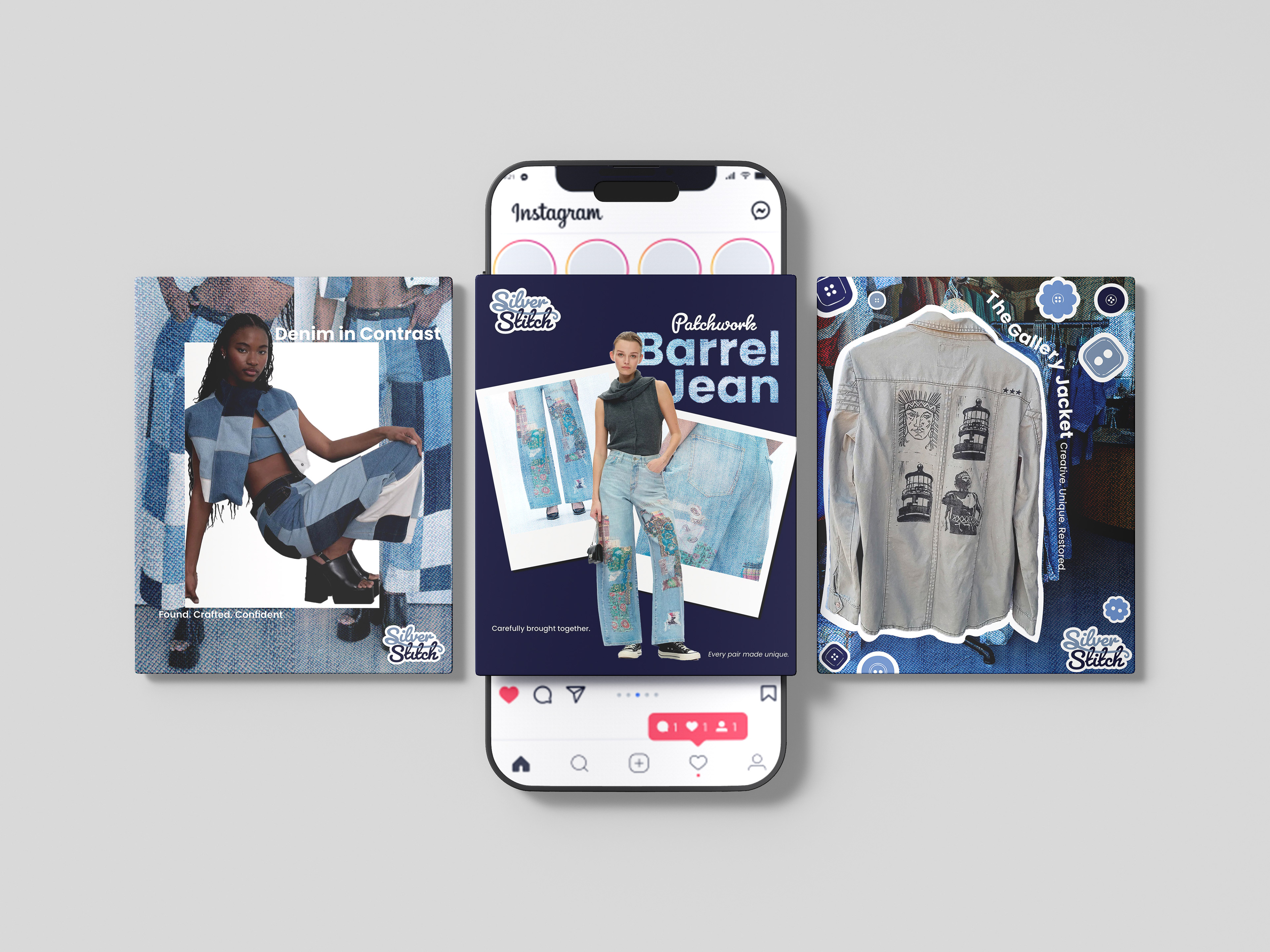
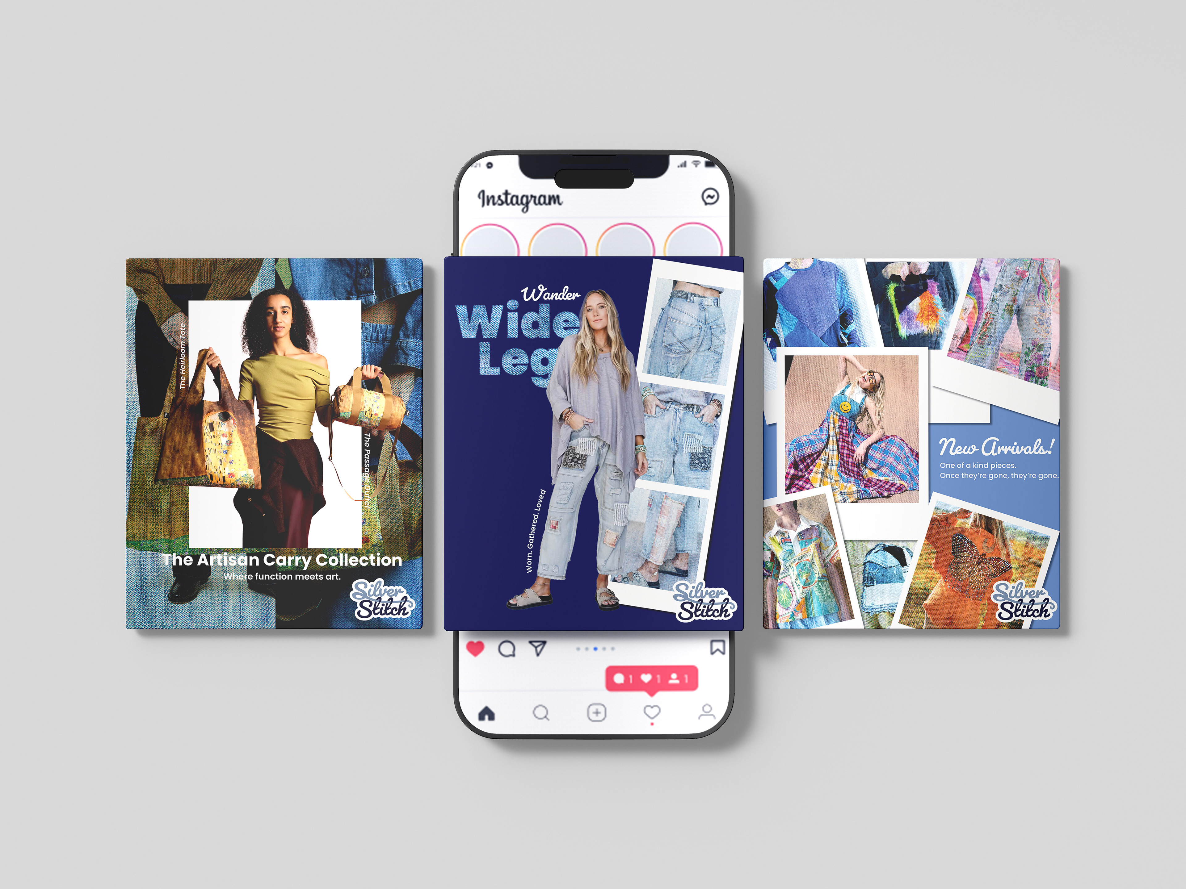
When developing the social media designs, I looked at clothing brands and boutiques on Instagram to understand how they present products and create a consistent feed. I paid attention to how brands use repeated elements, strong imagery, and minimal text to keep posts visually engaging while still feeling cohesive. I was also inspired by editorial-style layouts and the use of polaroid-style images to create a more personal and curated feel.
Key Design Decisions
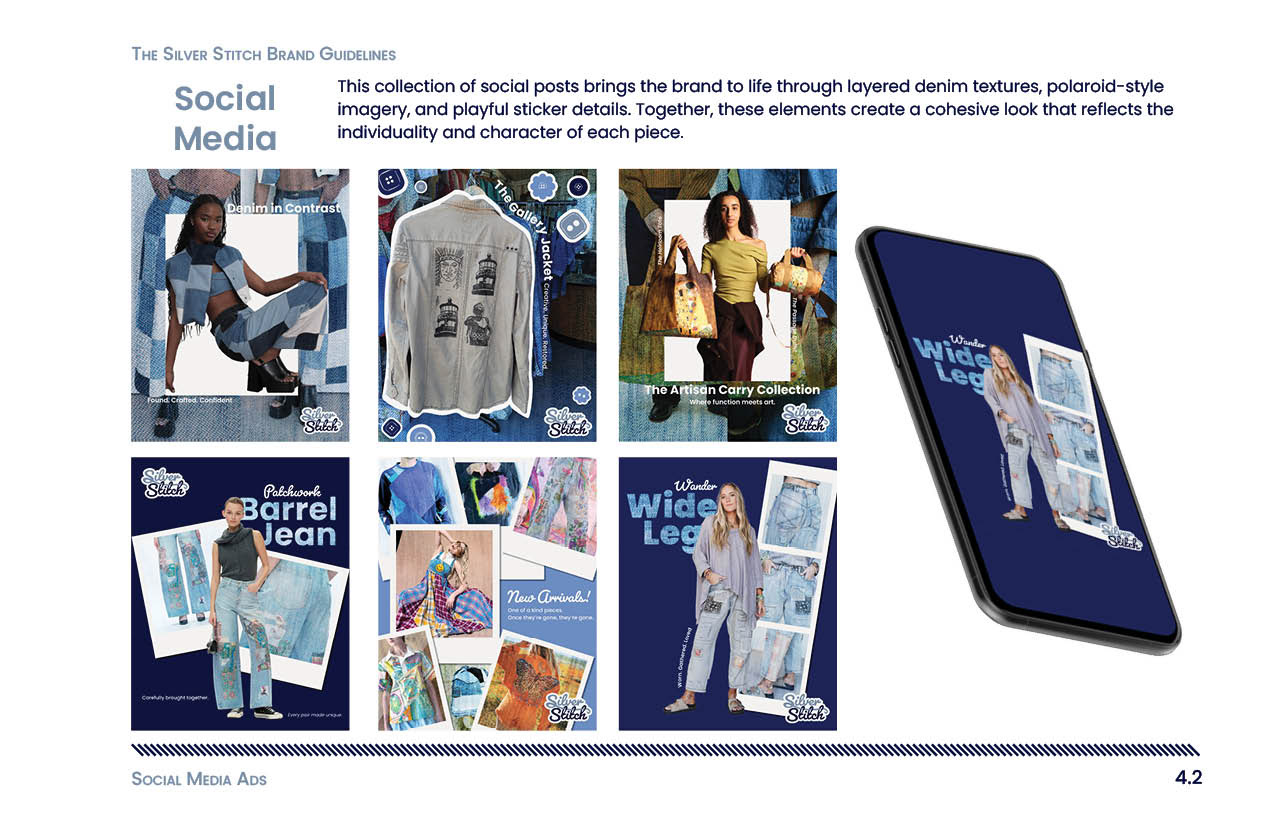
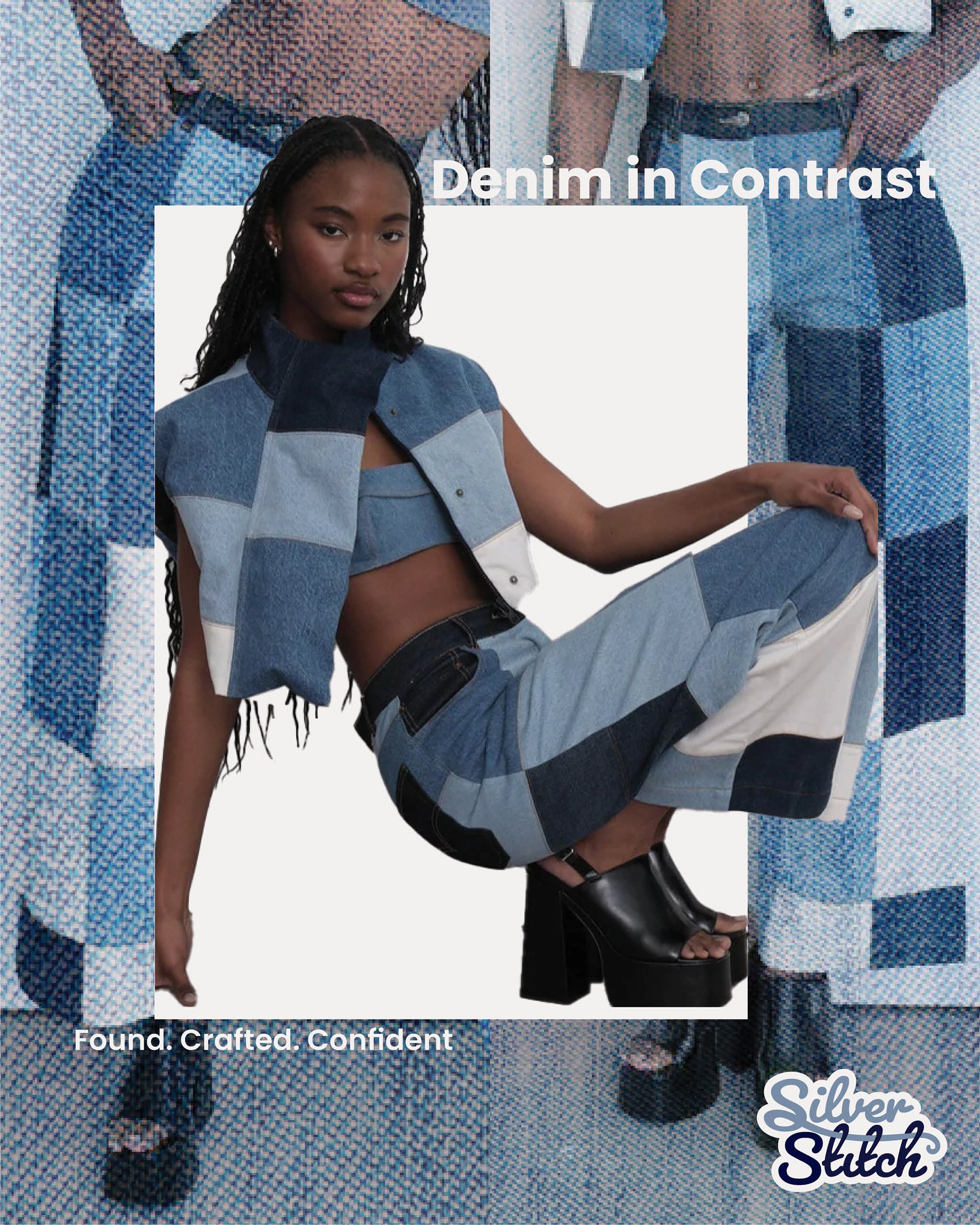
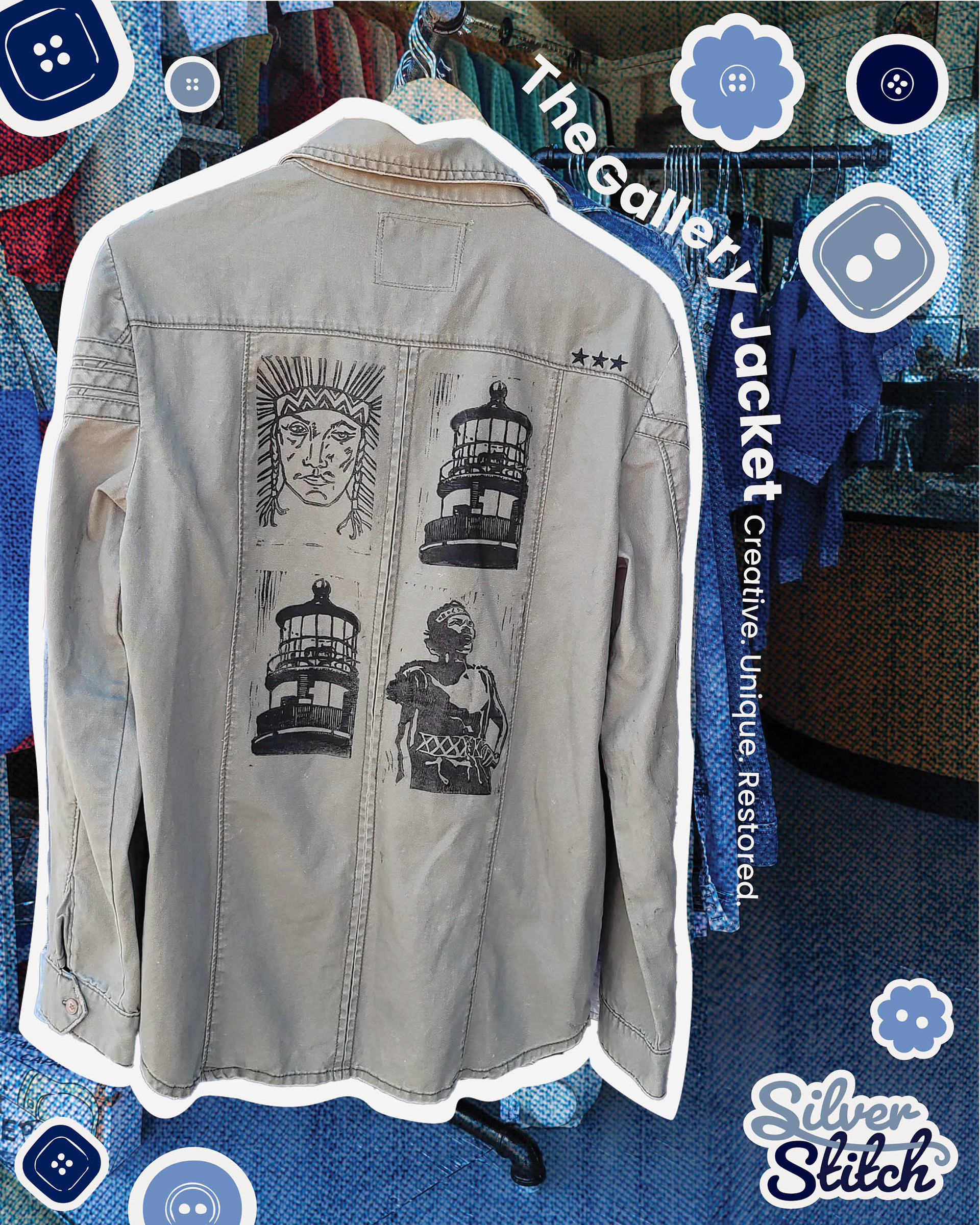
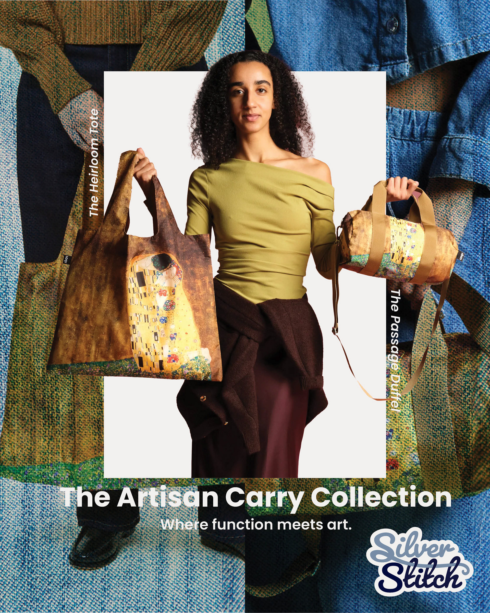
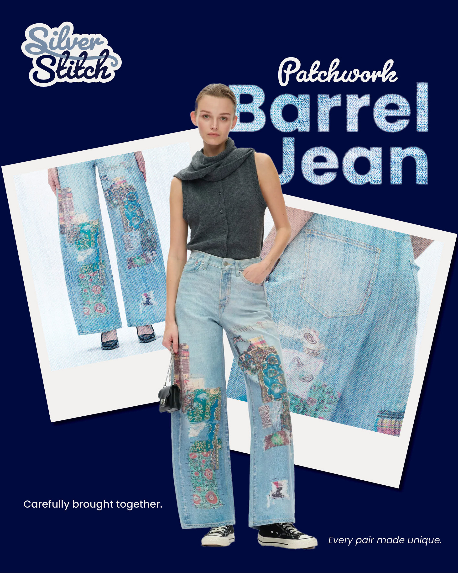
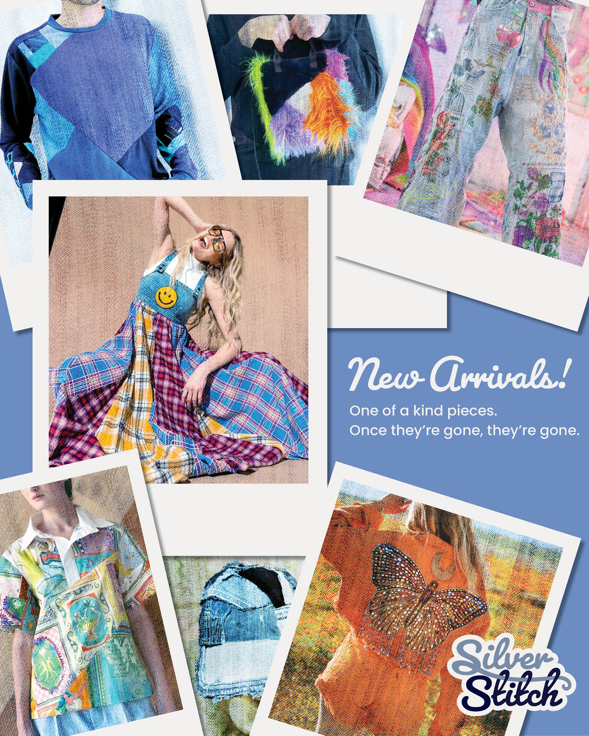
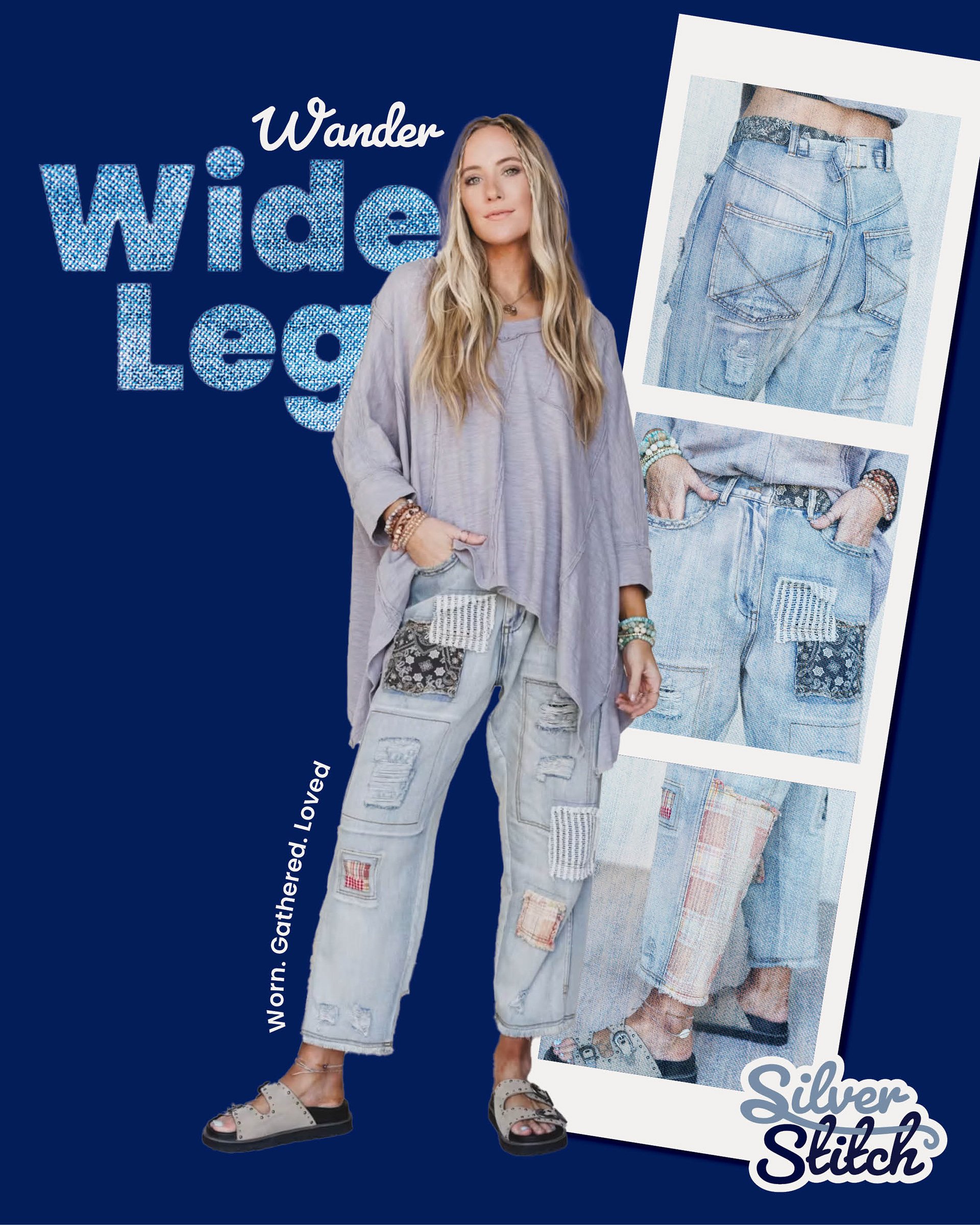
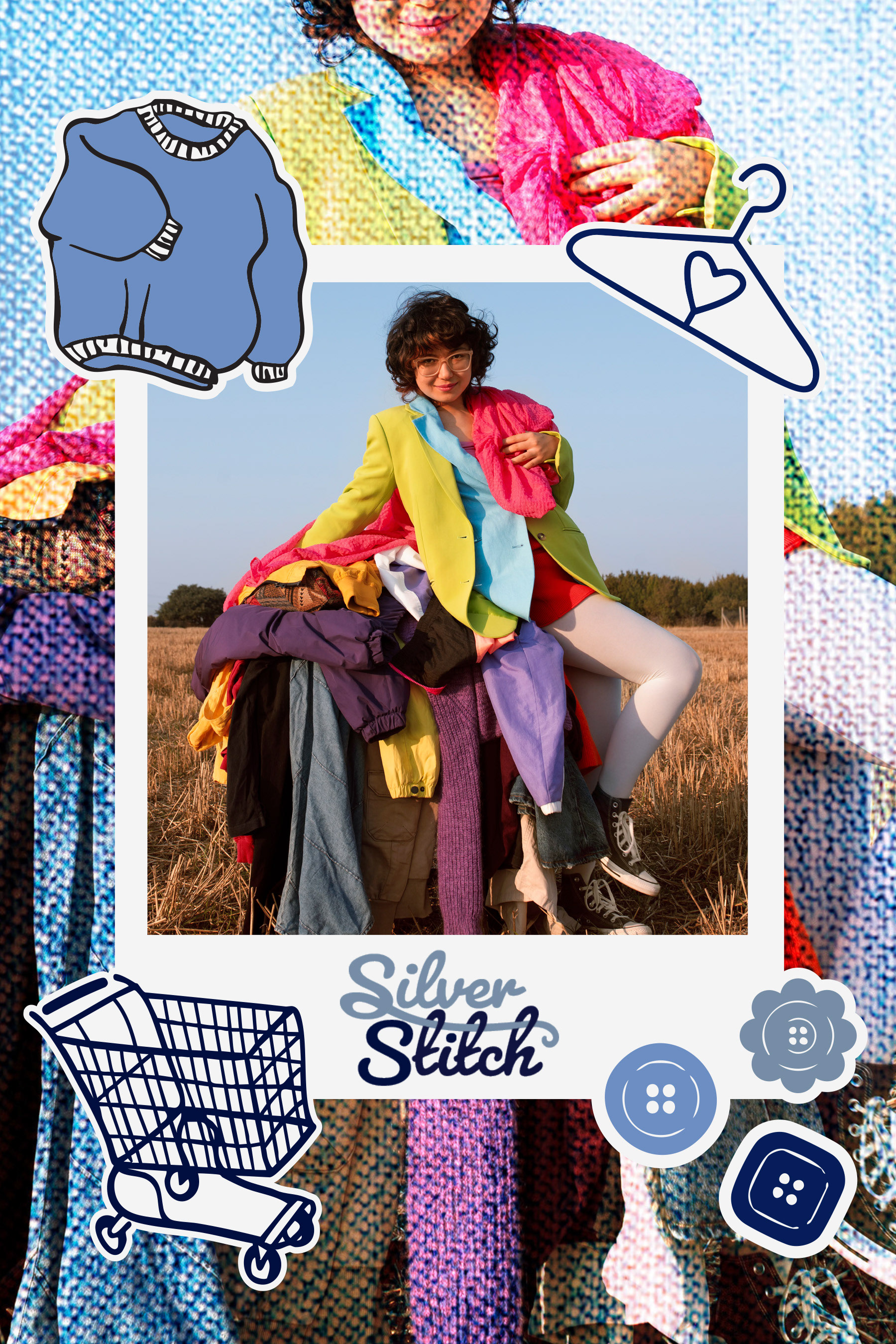
The social media series was built around a consistent visual system using denim-textured typography, polaroid imagery, and sticker elements. Each post was designed to feel slightly different while still clearly belonging to the same brand. Large, bold type was used to create hierarchy, while the polaroids and layered elements added movement and personality. These decisions helped the posts feel both visually interesting and consistent as a set.
Challenges and Revisions
One of the main challenges with social media designs was keeping each post visually interesting while still making them feel like part of the same brand. At first, some of the designs felt too different from one another, so I refined them by repeating key elements like the denim-textured typography, polaroid layouts, and sticker details. I also adjusted spacing and hierarchy to make sure each post felt clean and easy to read while still having personality.
Direct Mailer
Research and Inspiration
For the direct mail piece, I looked at promotional postcards and retail mailers to understand how brands balance strong visuals with clear information. I focused on how layout changes between the front and back, and how offers are presented in a way that encourages interaction. I was also inspired by editorial layouts and denim textures to keep the design aligned with the rest of the brand.
Key Design Decisions
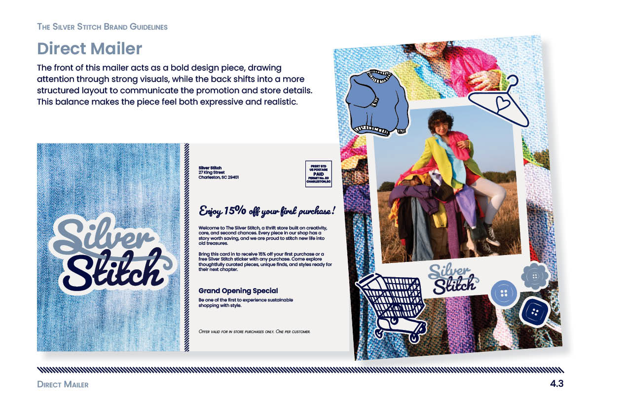
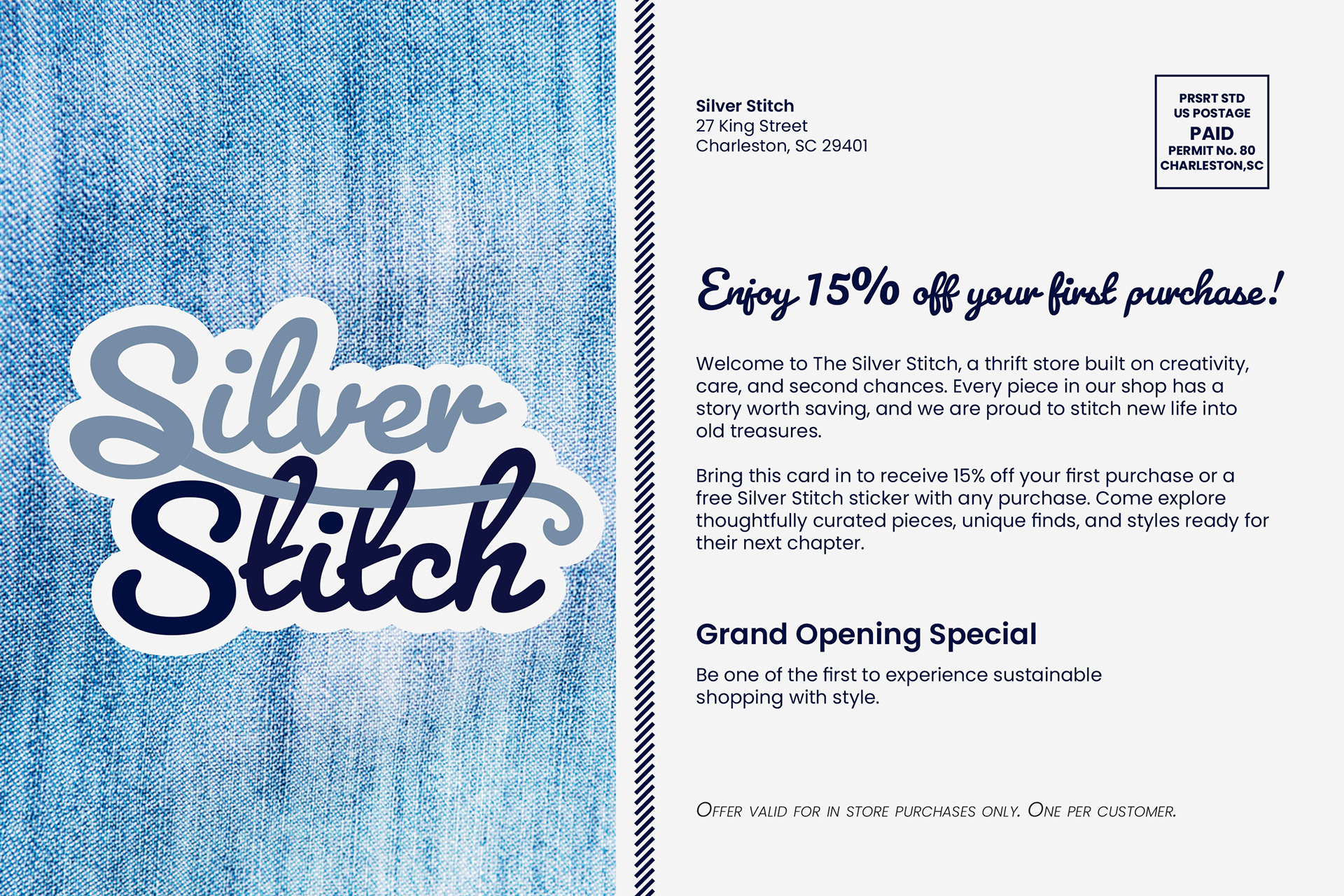
The mailer was designed with a visually driven front to capture attention, paired with a more structured back to communicate the promotion and store details. A split layout was used to separate these two functions while still keeping the design cohesive. Consistent elements like denim textures, stitched details, and typography were carried over from the brand system to maintain continuity. The inclusion of a promotional offer was also a key decision, adding a realistic and functional aspect to the piece.
Challenges and Revisions
A challenge with the direct mail piece was finding the right balance between a strong visual design and clear communication. The front initially felt too similar to an editorial layout, so I pushed it further as a design-focused piece to make it more eye-catching. On the back, I worked through different layout options to organize the promotional information in a clear and structured way. These revisions helped the mailer feel both creative and functional.
Outcome and Effectiveness
The final brand identity works because it feels cohesive, intentional, and adaptable. The consistent use of layout, color, typography, and stitched visual elements creates a unified system across all pieces. The addition of social media designs and a direct mailer strengthens the project by showing how the brand functions in real-world scenarios, from digital promotion to physical marketing.
Overall, Silver Stitch successfully communicates a clean yet warm aesthetic that reflects the creativity and individuality of thrifted and upcycled clothing.
Reflection
This project strengthened my understanding of building a complete brand system and applying it across multiple platforms. I learned how to maintain consistency while adapting designs for different formats, and how small details can improve the overall cohesion of a brand. Expanding the project into social media and direct mail helped me think more about real-world applications and how design connects with an audience beyond a single deliverable.