Project Overview
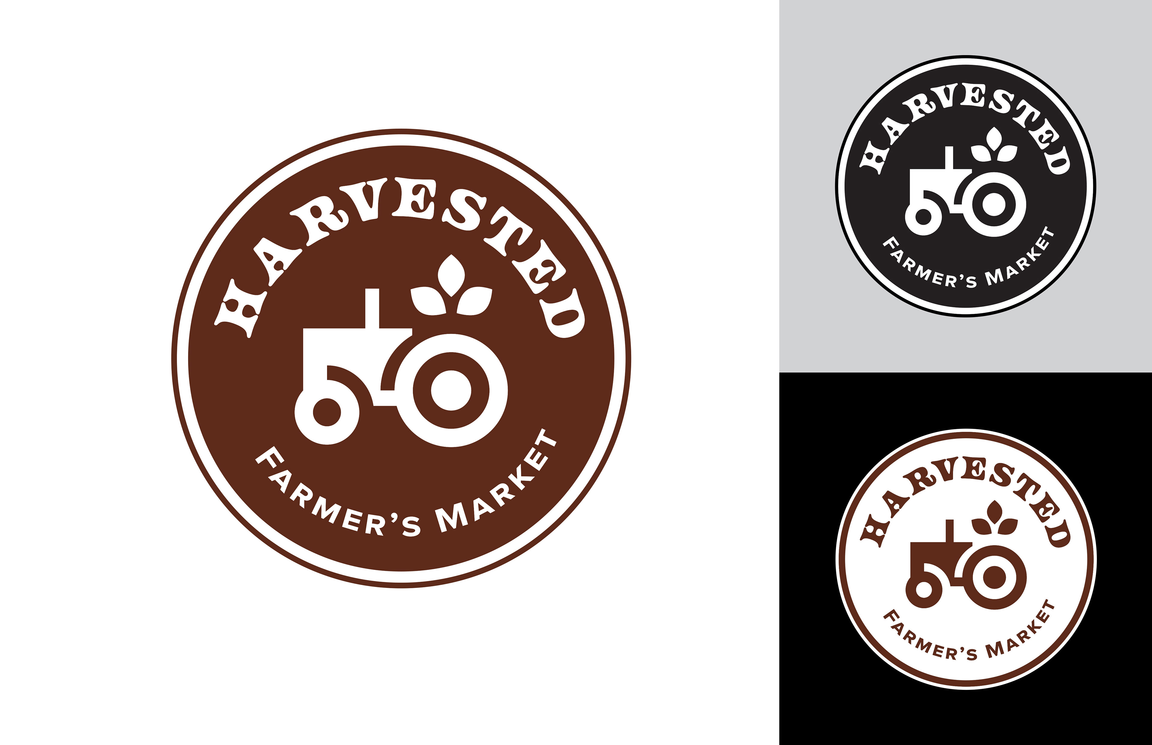
I created this brand identity project for a farmers market called Harvested to explore how design can capture a sense of community, tradition, and locally grown goods. The goal was to build a brand that feels warm, rustic, and inviting while still being clean and easy to understand. The project includes a full stationery set, a one page website, and a series of promotional flyers that all work together as a cohesive system. Through this project, I focused on creating a consistent visual identity that could be applied across both print and digital pieces in a way that feels natural and connected.
Problem
Many farmers markets lack a strong and consistent visual identity, which can make them feel unorganized or less memorable. Without clear branding, it becomes harder to attract visitors, communicate information, and build a recognizable presence in the community. The challenge was to create a brand that feels both traditional and modern, while clearly communicating what the market offers and why it matters.
Target Audience
The target audience for Harvested includes local families, young adults, and community members who value fresh food, handmade goods, and supporting local businesses. It also includes potential vendors such as farmers, bakers, and makers who are looking for a place to share their products. The brand needed to feel welcoming, trustworthy, and easy to connect with for a wide range of people.
Brand Needs
The Harvested brand needed a visual system that felt warm, natural, and rooted in simplicity. It needed to communicate freshness, quality, and community while staying clean and easy to navigate. The brand also needed to work across multiple platforms, including print materials and a digital website, while maintaining consistency in color, typography, and layout.
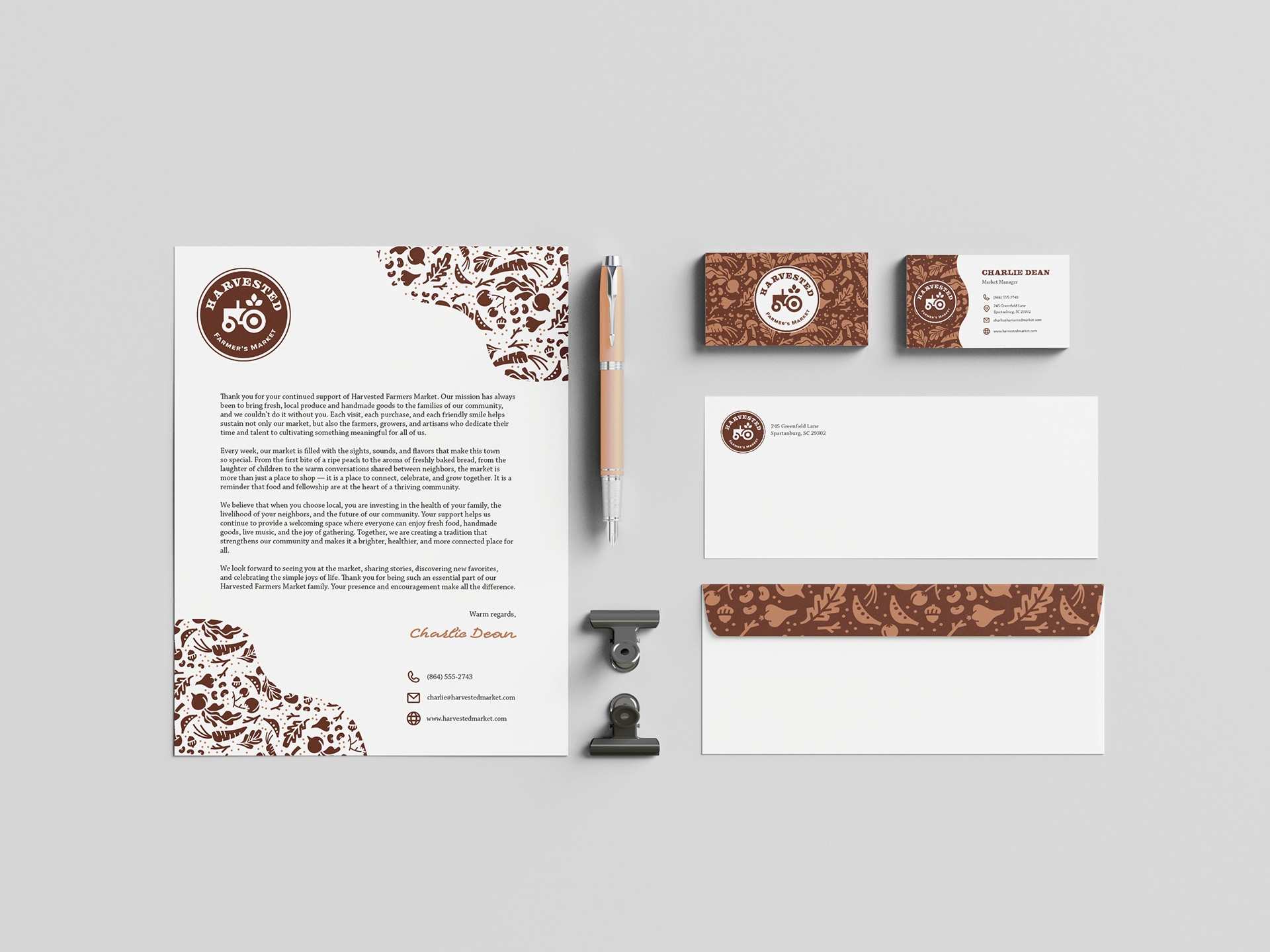
Stationery Set
(Letterhead, Business Card, Envelope)
Research and Inspiration
I looked at traditional farmers' markets, small local businesses, and rustic packaging for inspiration. I was drawn to natural textures, neutral color palettes, and simple typography that felt approachable and timeless. I also looked at clean editorial layouts to balance the rustic elements with a more modern structure.
Key Design Decisions
I used a minimal layout to keep the stationery clean and professional while still reflecting the brand’s rustic tone. The color palette is soft and natural, and the typography is simple and readable. Subtle design elements and spacing were used to create a sense of calm and consistency across all pieces.
Challenges and Revisions
One challenge was finding the right balance between rustic and modern. Early versions felt either too plain or too decorative. I revised the layouts by simplifying the elements and focusing more on spacing and hierarchy, which helped create a more refined and cohesive look.
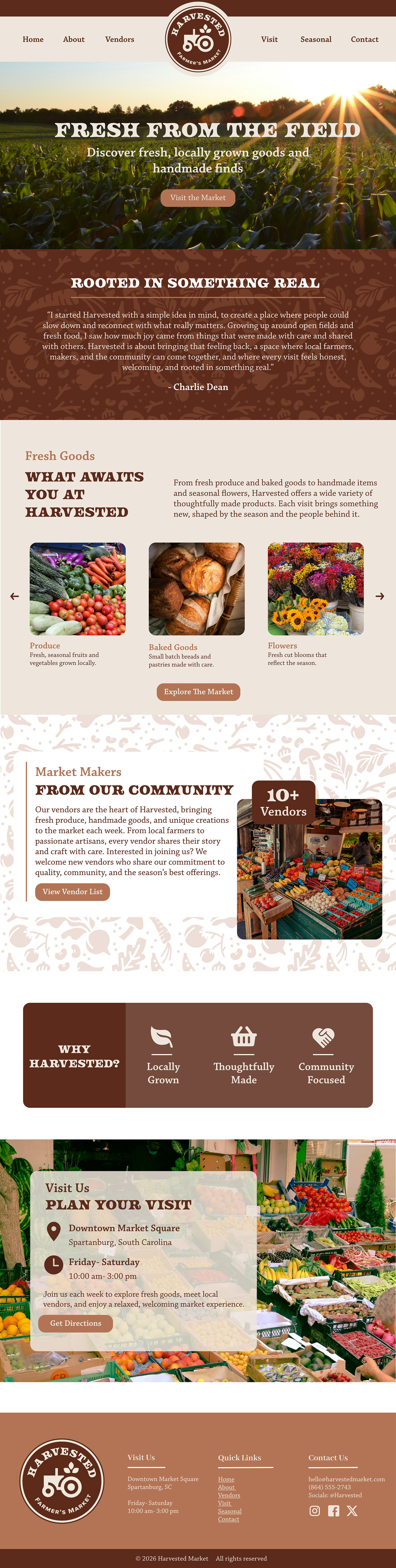
One Page Website
Research and Inspiration
I researched farmers' market websites and modern landing pages to understand how information is organized and how users navigate content. I was inspired by clean layouts, strong imagery, and simple navigation that allows users to quickly find what they need.
Key Design Decisions
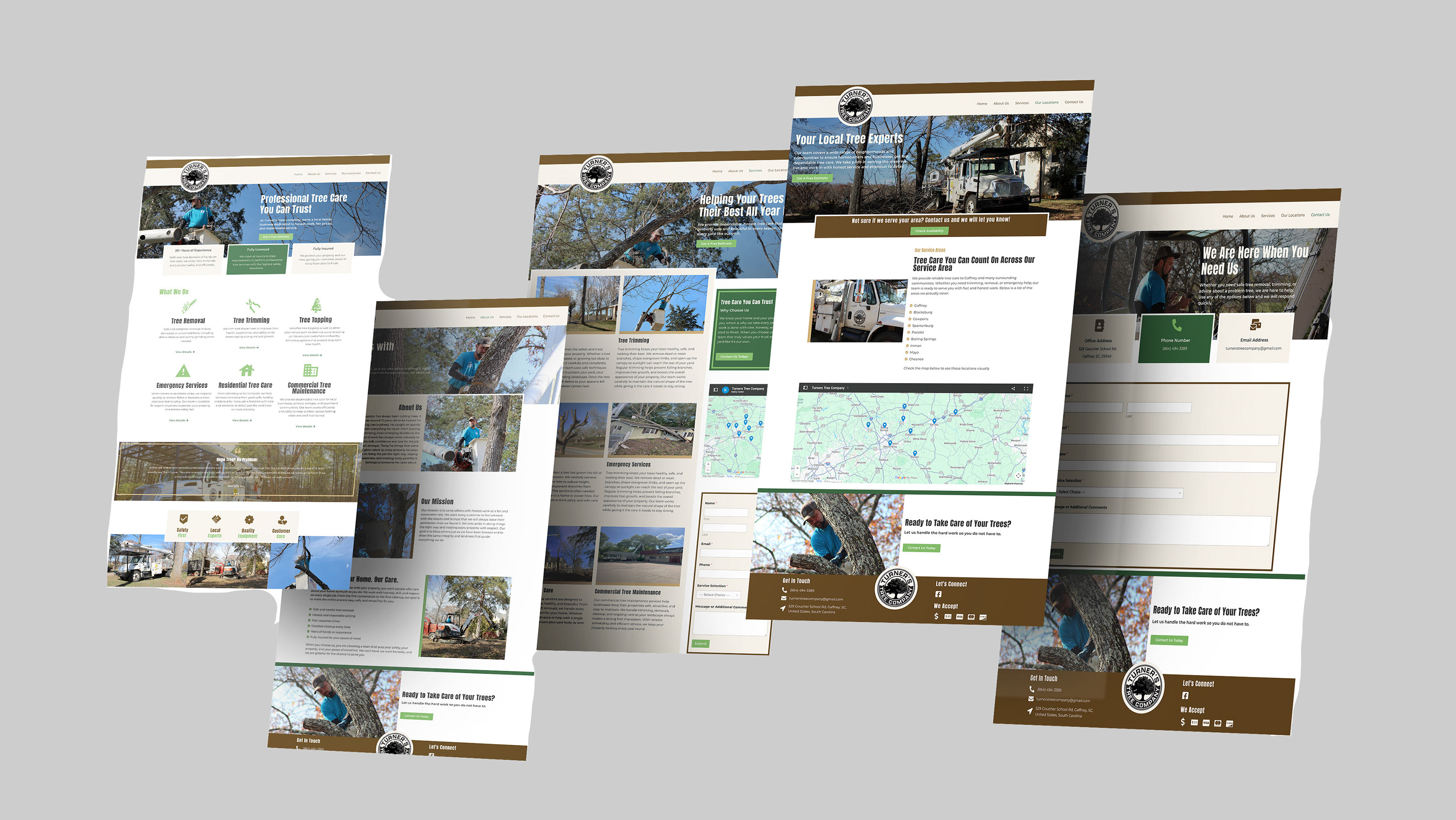
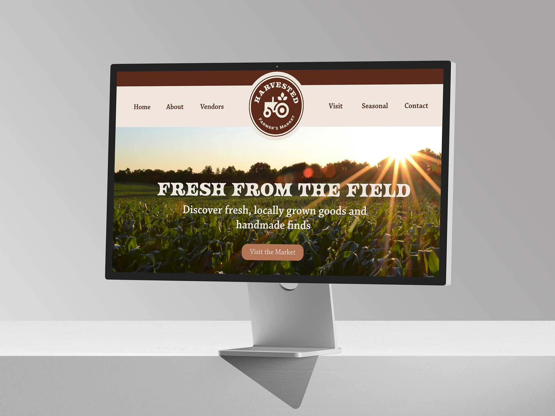
The website uses a clear section-based layout with strong visual hierarchy. I included sections like vendors, what you will find, and plan your visit to guide the user through the experience. The design uses large imagery, simple text, and consistent spacing to create a calm and inviting feel.
Challenges and Revisions
The biggest challenge was organizing content without making the page feel too long or crowded. I revised the layout by breaking content into sections and keeping text concise. This made the site easier to navigate and more visually balanced.
Promotional Flyers
(3-piece set)
Research and Inspiration
I looked at event posters, farmers market promotions, and editorial layouts for inspiration. I focused on how imagery and typography work together to create both emotional and informational designs. I also looked at how campaigns use consistent layouts across multiple pieces.
Key Design Decisions
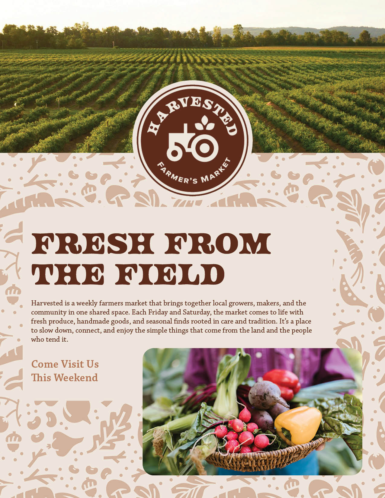
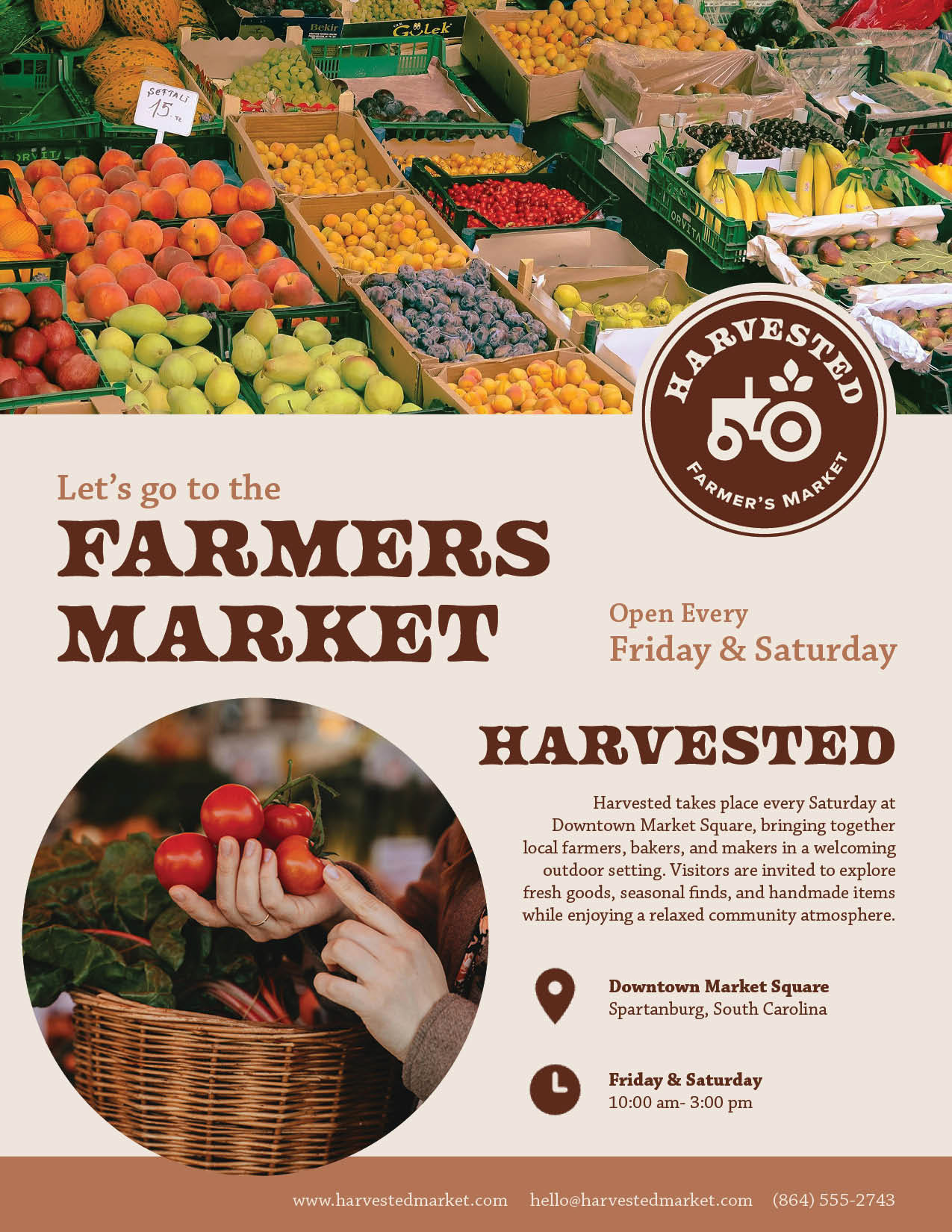
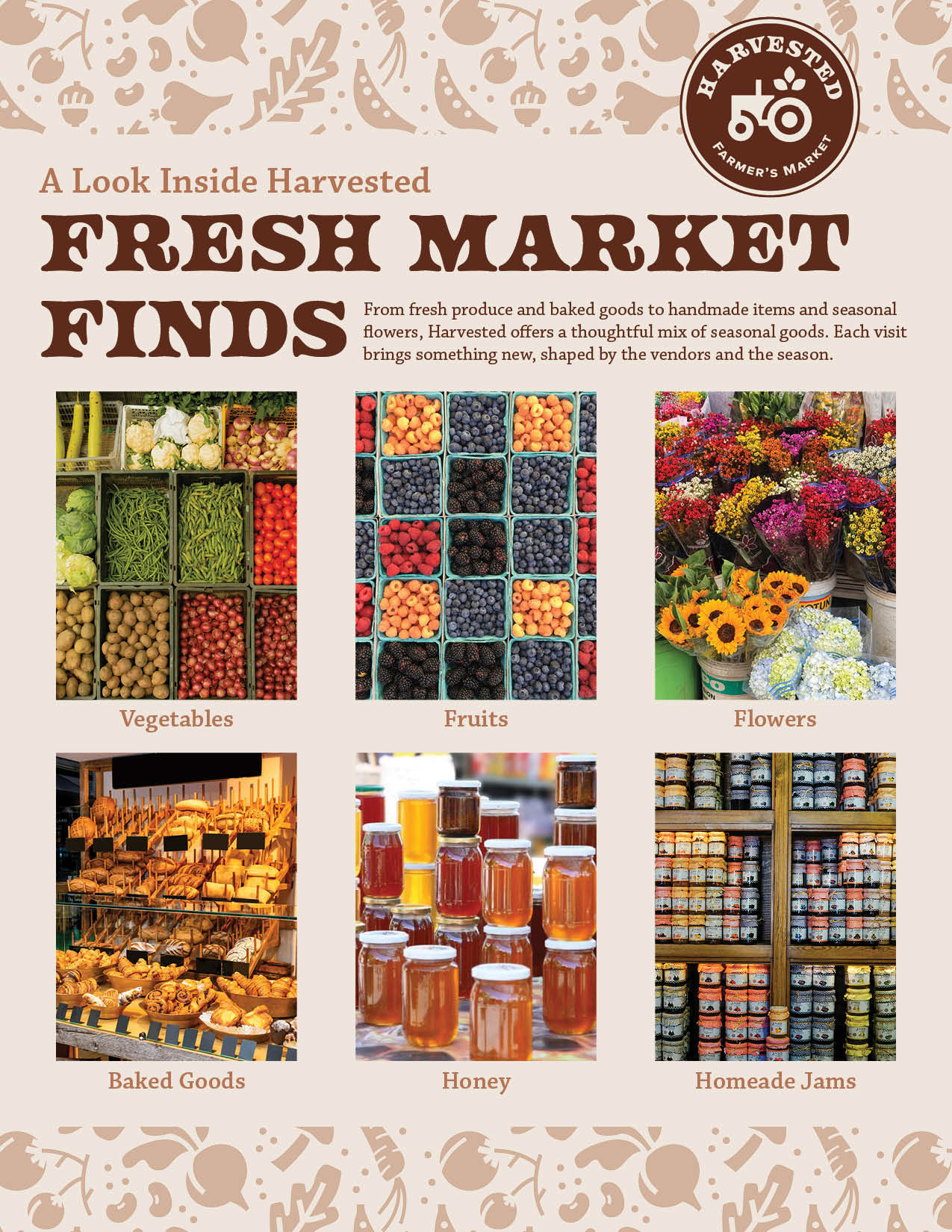
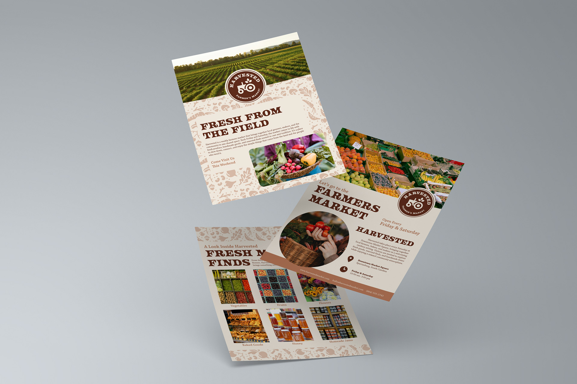
Each flyer focuses on a different purpose while staying visually consistent. One flyer invites people to the market, one highlights what you will find, and one shares market details. I used a consistent grid, typography system, and color palette across all three to create a unified campaign. Imagery plays a large role in communicating the experience of the market.
Challenges and Revisions
One challenge was making each flyer feel unique while still part of the same set. Early designs felt too similar or too disconnected. I revised the layouts by adjusting hierarchy, image use, and text placement so each flyer had its own focus while still feeling cohesive.
Outcome and Effectiveness
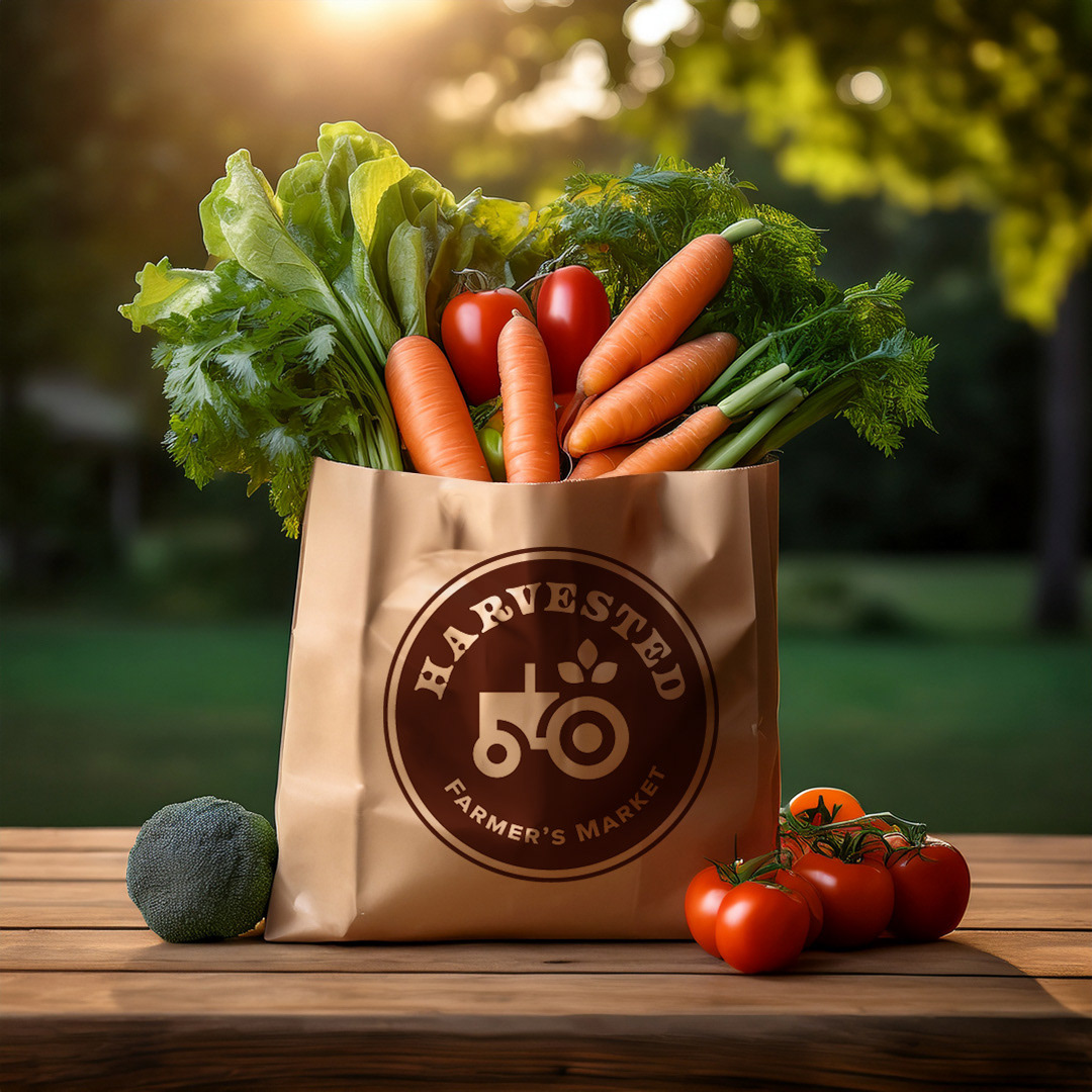
The final Harvested brand creates a clear and cohesive identity that works across both print and digital formats. The combination of rustic elements and clean design helps communicate the brand’s focus on community, quality, and simplicity. Each piece supports the overall system, making the brand feel consistent and recognizable. The project successfully shows how design can create a strong sense of place and connection.
Reflection
This project helped me better understand how to build a full brand system and apply it across multiple platforms. I learned how important consistency is, especially when working across print and digital design. I also learned how to balance visual style with functionality, making sure the design not only looks good but also communicates clearly. If I continued this project, I would explore more interactive elements for the website and expand the campaign with additional materials.