Project Overview
I created this brand identity project for a space academy for kids called Cosmic Cadets to explore how design can make learning feel exciting, imaginative, and engaging. The project includes a logo, two flyers, a trifold brochure, and a set of social media ads that all work together to create a cohesive and playful brand system. My goal was to design a visual identity that captures a sense of adventure and curiosity while still feeling clear and approachable for both kids and parents. I focused on strong layouts, consistent branding, and the use of bright colors, bold typography, and fun space-inspired graphics to bring the brand to life across multiple formats.
The ProblemMany educational programs for kids can feel too serious or not visually engaging, which makes it harder to capture attention. I wanted to solve the problem of how to present an educational space academy in a way that feels fun, exciting, and easy to understand, while still communicating important information clearly to parents.
Target AudienceThe main audience for Cosmic Cadets is parents of children ages 4 to 12 who are curious, creative, and interested in space and hands-on activities. The secondary audience is parents who are looking for educational programs that are both fun and beneficial for their child’s learning and development.
Brand NeedsThe brand needed to feel playful, imaginative, and energetic while still being organized and easy to read. It needed a strong visual identity that could work across print and digital formats. The design also needed to balance fun visuals for kids with clear information for parents, making it both engaging and informative.
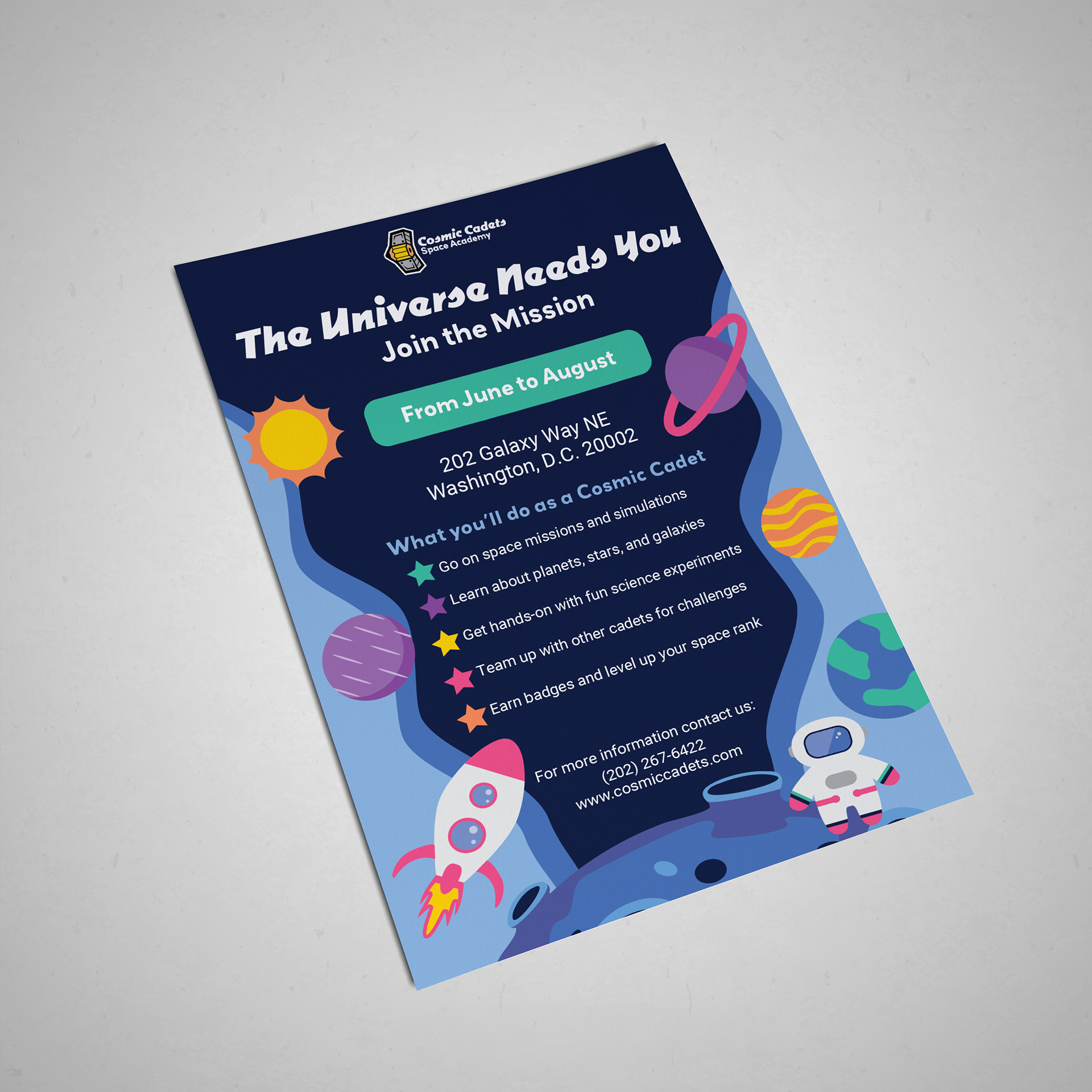
Promotional Flyer
Research and Inspiration
For the promotional flyer, I looked at summer camps, kids' programs, and space-themed visuals. I was inspired by bright colors, bold headlines, and layouts that quickly grab attention.
Key Design Decisions
I used a strong headline and a clear call to action to make the flyer eye-catching. I focused on a clean layout with bold typography and space-themed graphics like rockets and stars. I also used bright colors to make it feel fun and energetic
Challenges and Revisions
One challenge was balancing fun visuals with clear information. At first, the design felt too busy, so I simplified the layout and improved spacing to make it easier to read.
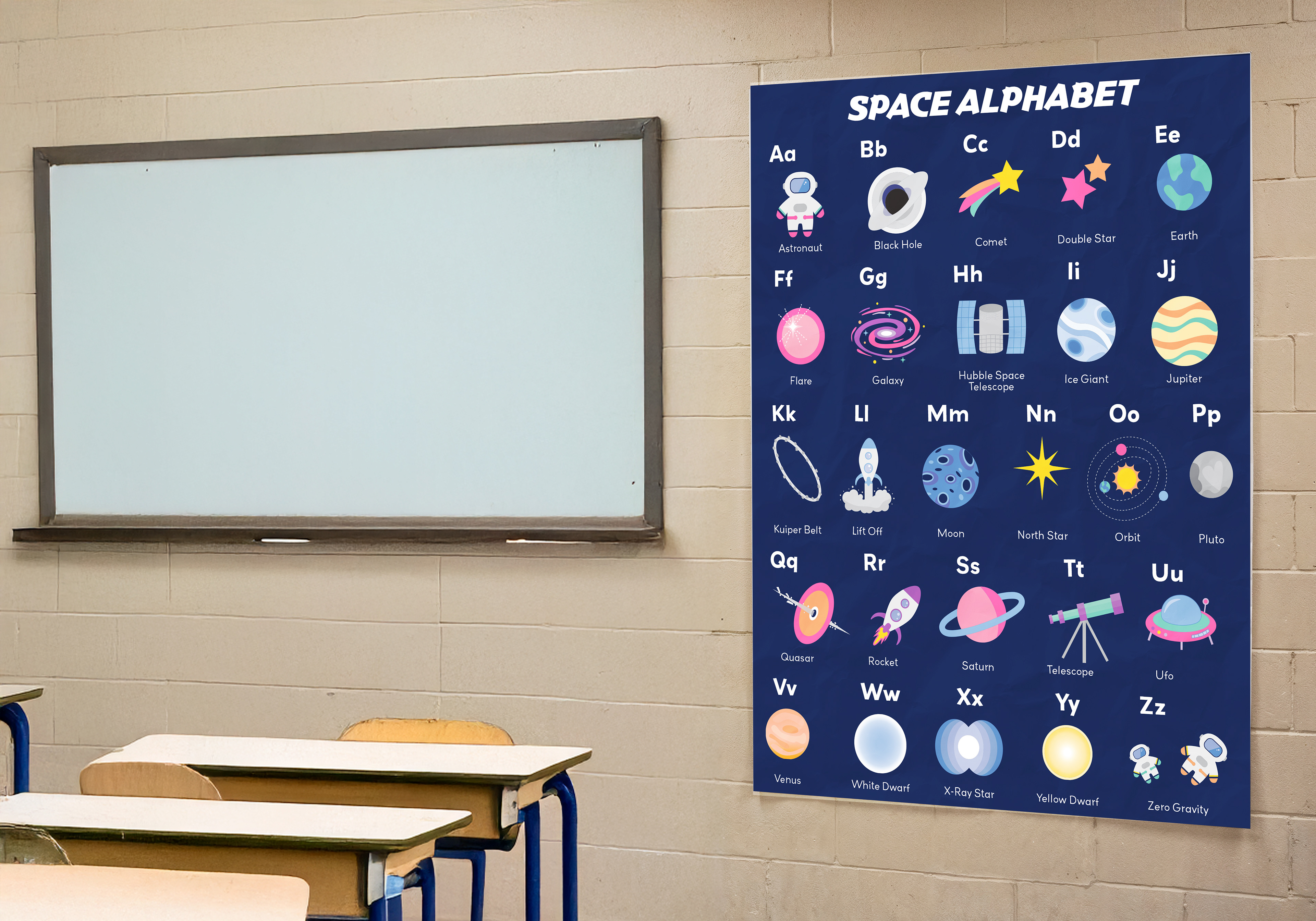
School Science Flyer
(ABC's of Space)
Research and Inspiration
I looked at educational posters for classrooms and alphabet charts. I wanted it to feel both educational and visually exciting for kids.
Key Design Decisions
I designed each letter to represent a space-related word and paired it with simple visuals. I kept the layout structured so it was easy to follow, while still using bright colors and fun illustrations.
Challenges and Revisions
It was challenging to keep all the letters consistent while still making each one interesting. I adjusted spacing, scale, and alignment to keep everything balanced and readable.
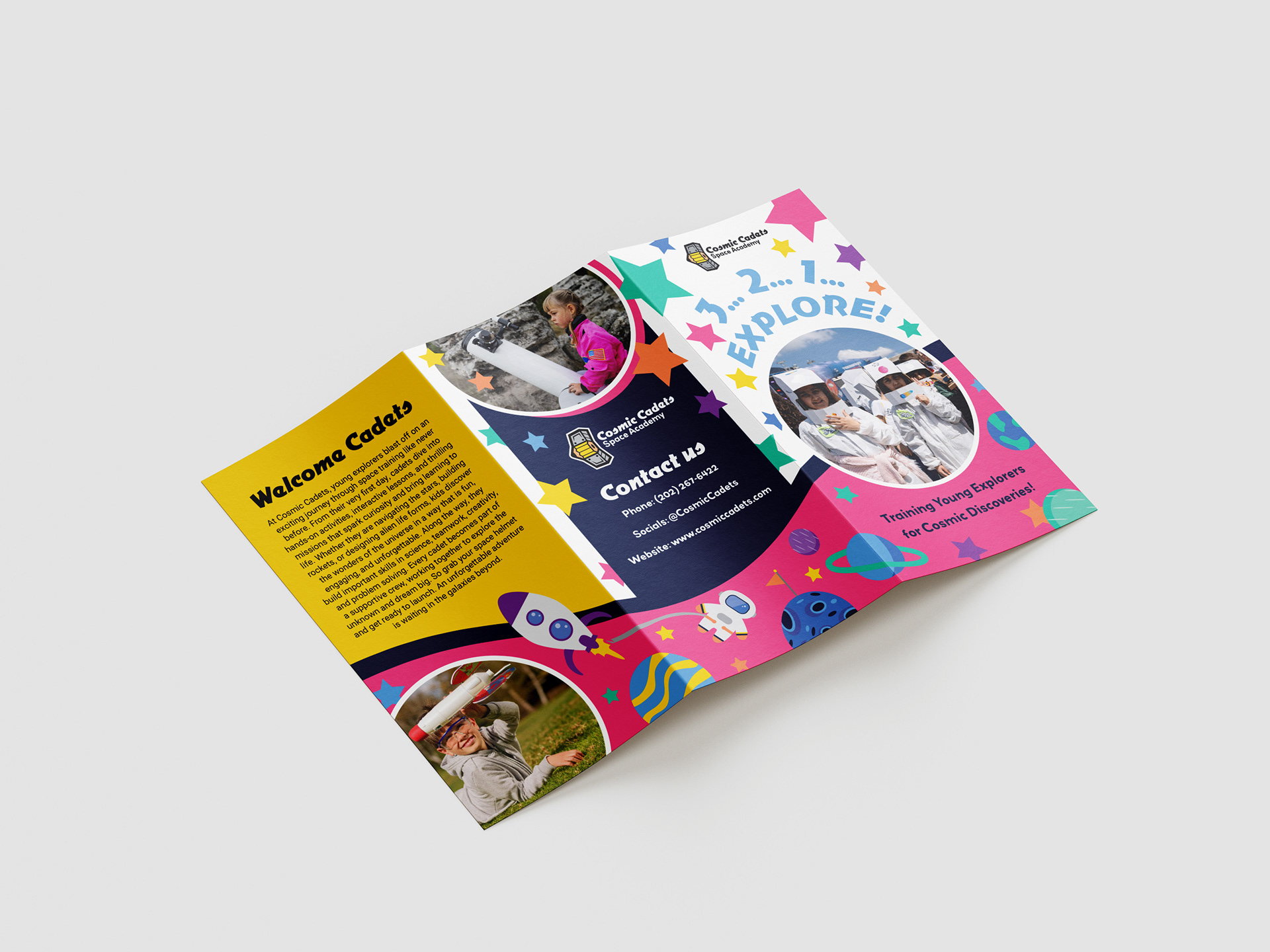
Trifold Brochure
Research and Inspiration
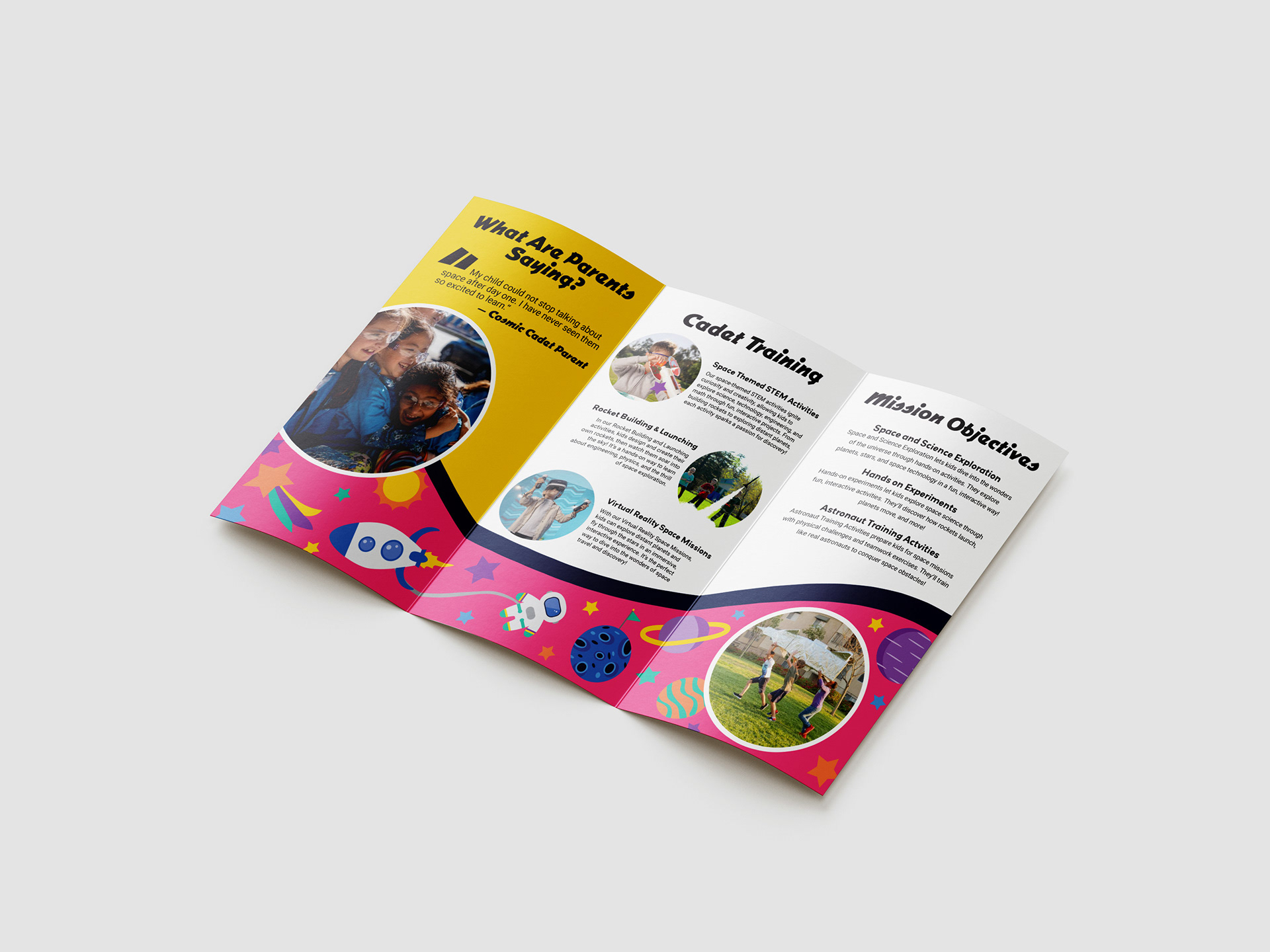
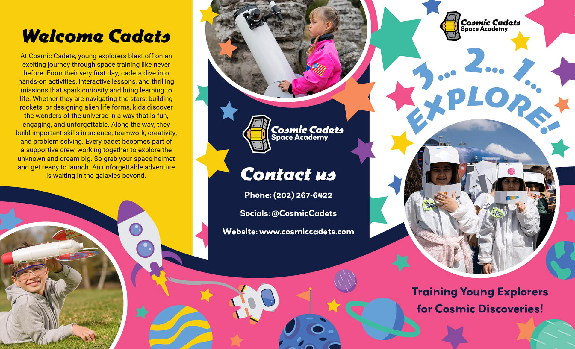
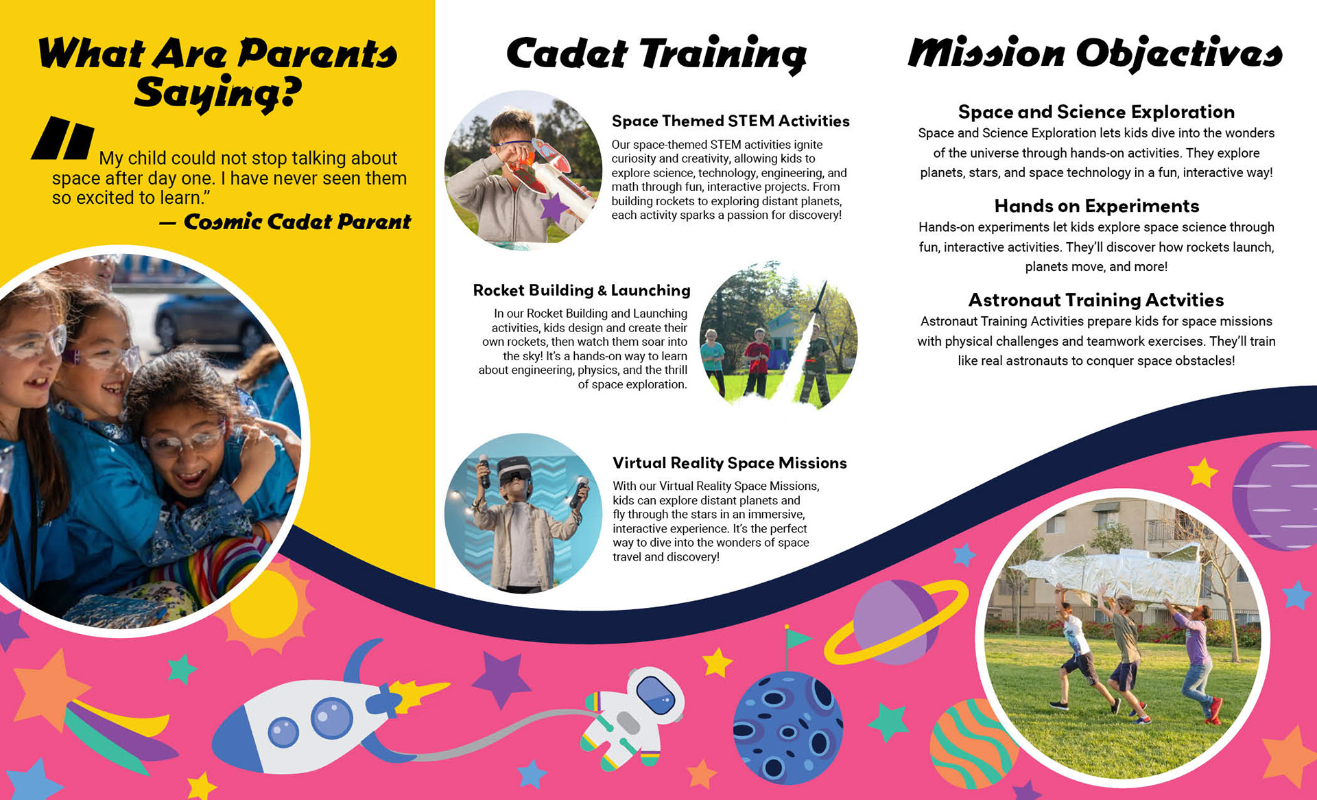
I researched brochures for camps and educational programs to understand how information is organized. I focused on layouts that guide the reader clearly from one section to the next.
Key Design Decisions
I divided the brochure into clear sections, including an introduction, program details, and a call to action. I used consistent colors, icons, and typography to keep everything cohesive. I also added fun elements like a testimonial to build trust and personality.
Challenges and Revisions
The biggest challenge was organizing a lot of information without making it feel crowded. I revised the layout several times to improve flow and make sure each panel had a clear purpose.
Social Media Ads
Research and Inspiration
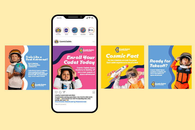
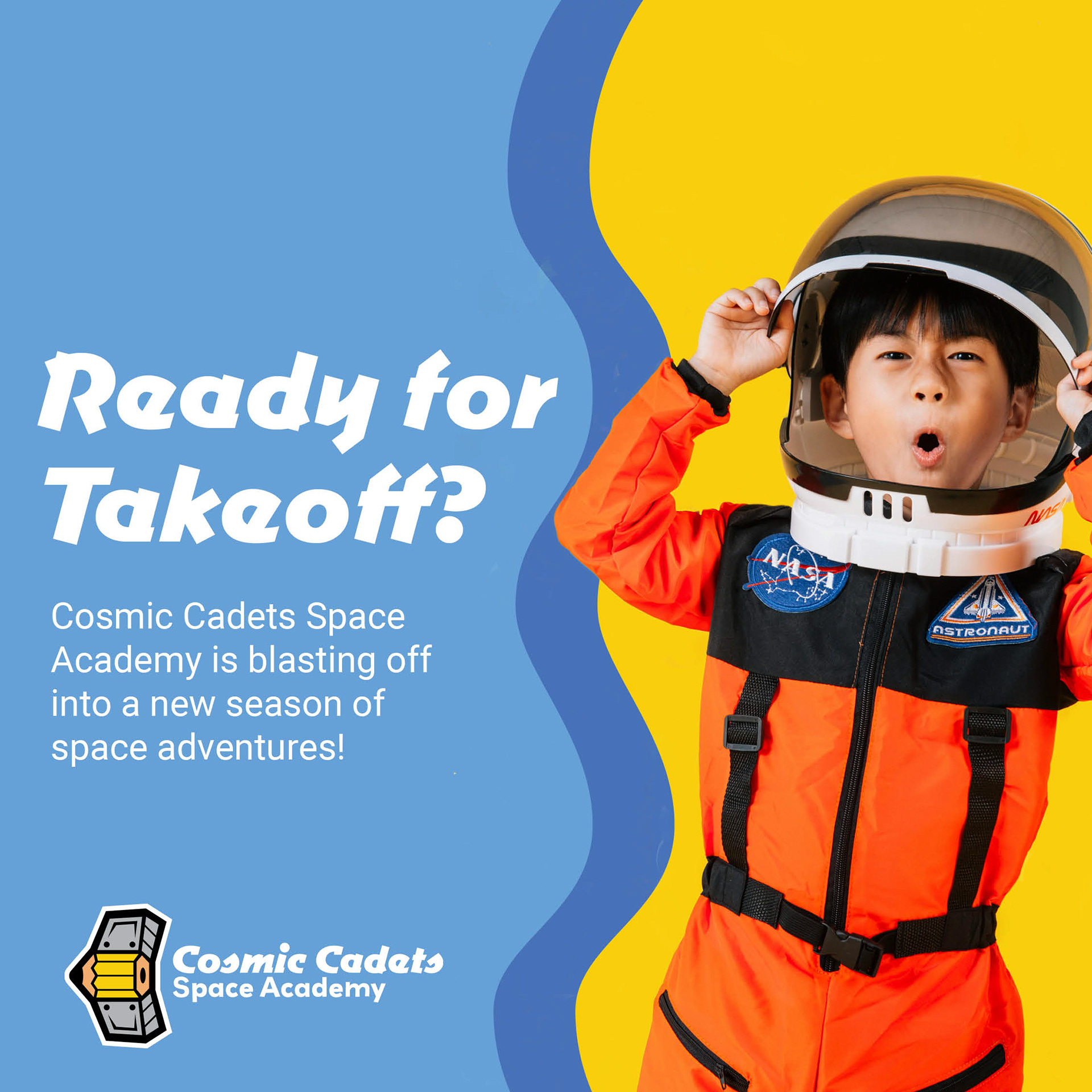
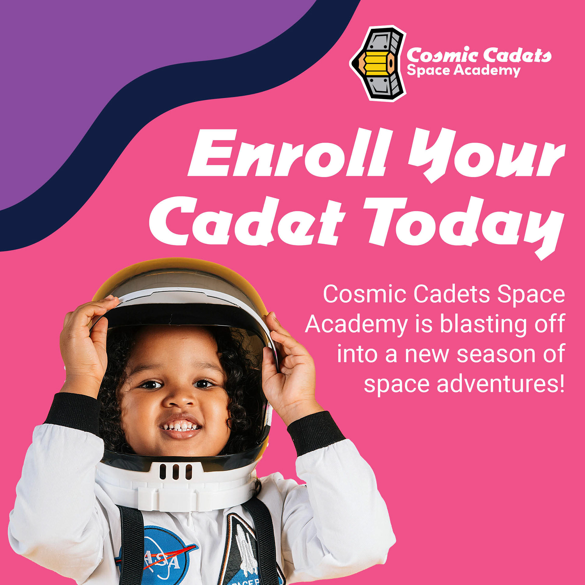
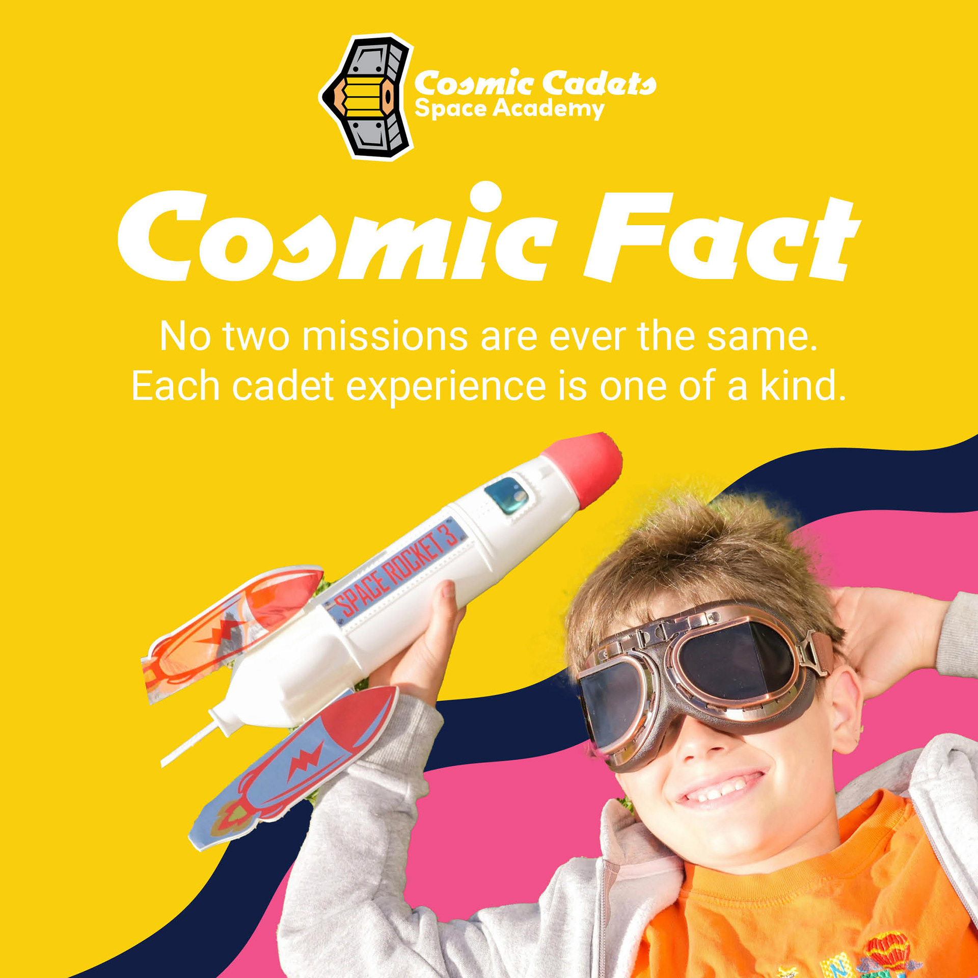
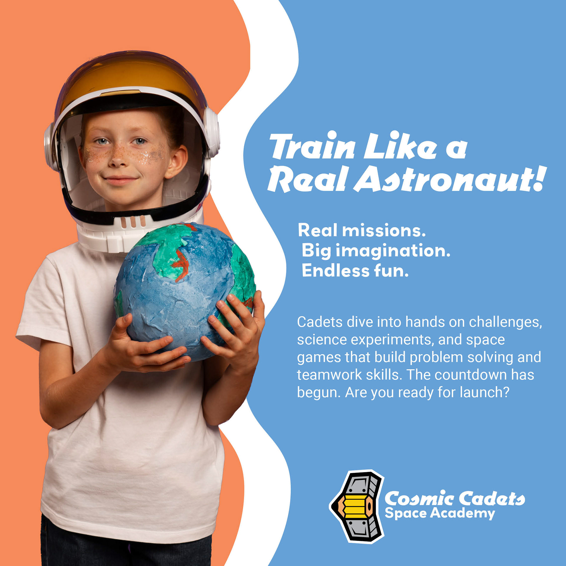
I looked at social media ads for kids' brands and educational programs. I noticed that bright visuals, short text, and strong headlines worked best for grabbing attention.
Key Design Decisions
I created bold headlines like “Train Like a Real Astronaut” and used short, engaging captions. I kept the designs visually consistent with the rest of the brand by using the same colors, typography, and space-themed graphics.
Challenges and Revisions
One challenge was keeping the designs simple enough for social media while still making them stand out. I reduced text and focused more on strong visuals and clear messaging.
Outcome and Effectiveness
The final Cosmic Cadets brand feels fun, cohesive, and engaging across all pieces. Each design works together to create a strong visual identity that captures attention and communicates clearly. The combination of playful graphics and structured layouts makes the brand appealing to both kids and parents.
Reflection
This project helped me better understand how to design for a specific audience while keeping branding consistent across different formats. I learned how to balance fun and creativity with clear communication, especially when designing for both kids and adults. If I continued this project, I would expand it by creating a website or interactive elements to bring the brand even more to life.